Starship Size Issues
Galileo 7 ShuttleDeep Space 9Nova ClassXindi Prototype ProbeDenobulan Medical ShipCalifornia ClassProtostar ClassDauntless ClassLamarr ClassVoyager-A ShuttleConstitution III ClassDiscovery Rollercoasters
This article investigates cases of starship, shuttle or station size mismatches from various Star Trek series. The focus is on errors that come to pass as soon as in the design process of the ship, of the production of the episode or of the very story that is meant to be told - rather than on occasional wrong VFX sizes or on repurposing of existing models.
Note that particularly controversial or particularly complex cases, such as the Klingon Bird-of-Prey, the Defiant or the Abrams Enterprise and several more are exhaustively discussed in separate articles.
Galileo 7 Shuttle
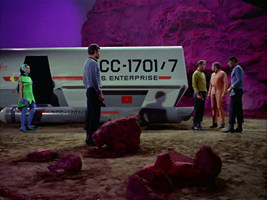
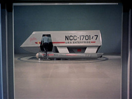
The probably earliest example of a size mismatch in Star Trek is the Galileo-type aka Class F shuttlecraft from TOS. After it was sadly not available to rescue Sulu and his landing party in "The Enemy Within", the full-scale mock-up was famously built during the first season on behalf of AMT, who were licensed to sell model kits of the shuttle in return. The shuttle first appeared in TOS: "The Galileo Seven", as a full-scale interior set, a full-scale mock-up and a miniature.
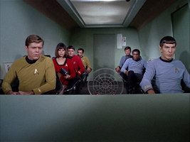
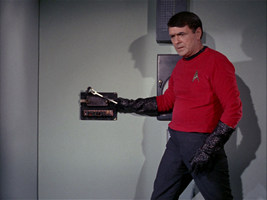
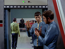
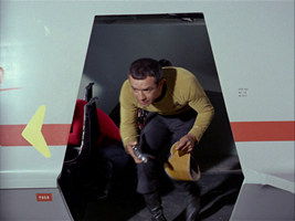
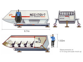
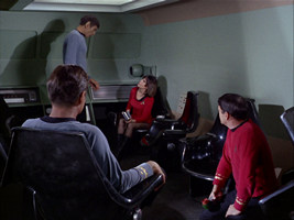
The interior set was separate from the mock-up. We can see how Spock (Leonard Nimoy was 1.82m tall) can stand upright when inside, and still has about 10cm of head clearance. Everyone stepping out through the door needs to duck, since it is some 20cm lower than the ceiling after all. But as we see Spock or Sarek in "Journey to Babel" (Mark Lenard also measured 1.82m) in the door, it is only as high as their shoulders. This precludes that he could be able to stand inside. The shuttle mock-up measures 6.7m. It appears that all dimensions of the interior set, also the length and the width, were scaled up by about 15%. The aft compartment as prominently seen in "The Galileo Seven" otherwise wouldn't fit into the length of the shuttle, whose aft wall is both recessed and sloped. Fortunately, this mismatch is hardly ever noticeable, except perhaps in the direct comparisons of the interior set and the (rare) looks inside through the door.
Deep Space 9
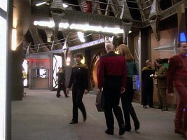
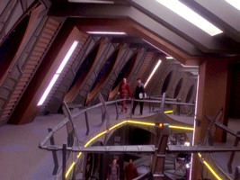
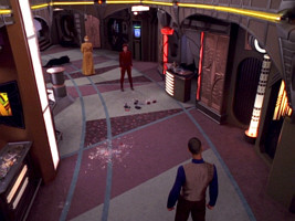
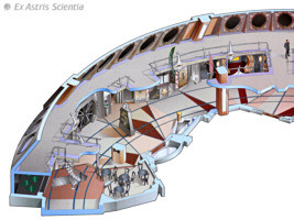
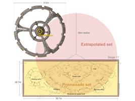
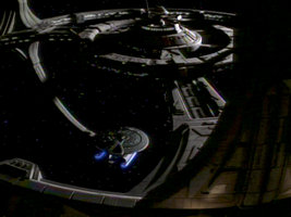
The original design diameter of Deep Space 9 was 3600' or 1097m. One obvious way to verify this is to compare the full-size promenade deck set with the corresponding external features (the window ring) on the studio miniature. The promenade was the largest set constructed for Star Trek at the time. It filled Paramount's Stage 17, which measures 186' (56.7m) by 68'(20.7m). Approximately a third (120°) of the whole ring was built, with Quark's Bar in the center. As we supplement the two other segments with matching curvature, we can see that the set amounts to a bit more than 120°, and we get a diameter of 50 meters for the promenade (with the windows on the upper level being the border). This gives us merely 610m for the station on the whole (even less if we take the schematic diagrams from the Fact Files, in which the core is too large relative to the rest).
Note Curiously, there are ten segments of upper-level promenade windows on the Deep Space 9 studio miniature, although the architecture of the station is otherwise based on 120° angles and integer fractions thereof. Perhaps this was done to better align the exterior with the set, which consists of a bit more than three of those segments. The Fact Files correctly reproduces the structure (but not the size). The Eaglemoss model too is correct in this regard, with 10 segments. The DS9 documentary "What We Left Behind" uses a CG model with 9 segments, whereas the DS9TM depicts 12 segments with only 4 instead of 5 windows each.
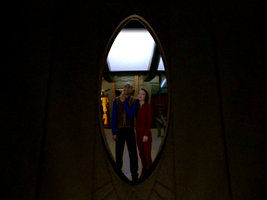
If we look at the large oval windows, they are a bit more than 3m tall, which too results in somewhat more than 600m for the overall station diameter. So it seems that the promenade deck was built at a scale of about 60% relative to the intended size of Deep Space 9. This discrepancy is hardly ever noticeable, however. We may easily imagine the diameter of the promenade is somewhat greater than 50m.
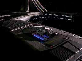
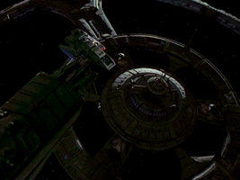
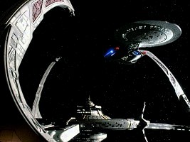
The size of Deep Space 9 compared to docked starships is more problematic. The scaling works out very nicely relative to the Danube-class runabout, which can be seen in the landing bay as well on the docking pylons on many occasions (mostly using the same stock footage). With the runabout being 23m long, the station is a bit more than a kilometer across in both of these comparisons. The ships that cause trouble are the big ones. We can see the 642.5m long USS Enterprise docked to the upper pylon in DS9: "Emissary" and once again in TNG: "Birthright I" (using stock footage from DS9 pilot). Here, the station has to be considerably more than 1km across, in order to allow the ship to be placed like this. In some shots with a Nebula-class ship (and in the opening credits since the 4th season), the station seems to be even more than 2km wide (the reason for which may be that the Nebula was falsely thought to be a smaller sister of the Galaxy class). The 1451m diameter of the station in the Deep Space Nine Technical Manual may be an average between the two extremes, although it is not sufficient to make sense of the shots with the tiny Nebula.
Comparisons with the Klingon BoP and the USS Defiant are not authoritative, as the sizes of these ships are disputed just as well. Yet, with a BoP being 110m long and the Defiant being 120m, Deep Space 9 could be about 1000m in diameter in most common shots. There may be other, less prominent shots that would really require the station to be larger, but overall 1097m or perhaps 1000m seems like a good compromise if we neglect the Nebula issue.
Nova Class
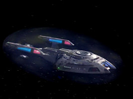
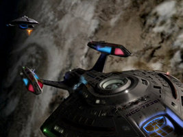
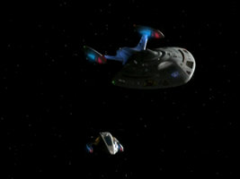
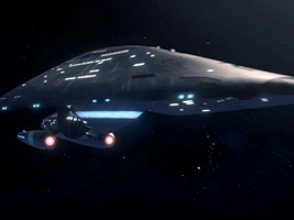
The eponymous ship of the double feature VOY: "Equinox I/II" is a small Nova-class science vessel that was pulled into the Delta Quadrant by the Caretaker, just like Voyager. The Equinox had to endure more hardships, partly because of bad luck and partly due to it being ill-equipped for a long journey through hostile regions of space. We can see the two ships relative to each other at various points, especially in the first part. The Equinox occasionally seems to measure as little as 150 meters (in the two MSD comparisons) and otherwise can't be much longer than 180 meters (in ship encounters), compared to the 344m long Voyager.
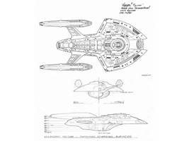
The ship may not always have been intended to be that small, however. When Rick Sternbach was asked to design the Equinox, he remembered the top view of the Defiant Pathfinder that he and Doug Drexler had produced for the Deep Space Nine Technical Manual. Sternbach fleshed out a three-dimensional design that deviated from the DS9TM depiction in a couple of aspects. He overall smoothed out the hull contours, put a deflector into the gap where supposedly a launcher is located on the Pathfinder, added more windows and changed the shape of the bridge module. Also, the overall proportions of the Equinox are different; the ship is less wide. He labeled the drawings with "Noble class", which was apparently meant to be the class name until it was changed to Nova class.
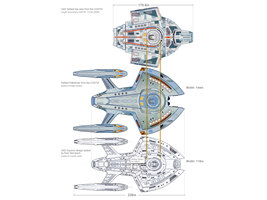
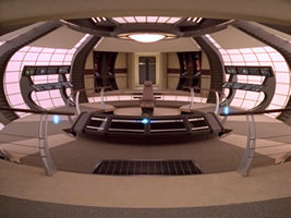
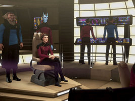
When it comes to the dimensions of the Equinox, Sternbach "drew the blueprints at 1"=30', and the ship is 24.25" long, so the real thing would be 727.5 feet or 221.74 meters", according to his post at Drex Files from 2009. The scaling was probably under the assumption that the Equinox is still the same size (at least, the same hull length) as the Defiant Pathfinder, which uses the same bridge module as the actual Defiant design. As we try to reproduce this line of reasoning (with a length of 170.6m of the Defiant as in the DS9TM), the Equinox would be even 236m long. We may call the scaling into question considering that the Defiant 120m plans were scaled up to 170m in the DS9TM. We may want to recalculate the length of the Equinox to 120m/170m*236m = 167m to account for the error in the book. However, if anything, the assumed size of the Defiant was merely a starting point for the design. Also, since the bridge superstructure on the Equinox doesn't look like the one on the Defiant and the only link is a non-canon design, there is no need to scale the Nova class accordingly. The set used for the Equinox bridge is not the one of the Defiant but the same as of the considerably larger Voyager anyway.
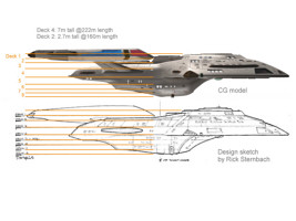
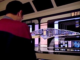
So let us look at how Sternbach finalized the Equinox. He laid out the ship with eight decks, of which some are considerably taller than others. When his sketches had been transferred to CGI, the proportions were still the same. Only the decks didn't quite match up any longer, but at least their number didn't change. The Equinox definitely has eight decks, as also confirmed by the MSD. We can now try to make sense of the decks at 222m (Sternbach's intended size) and at 160m (the minimum size that is required by some scenes in "Equinox I/II"). It turns out that deck 4, the tallest deck, would measure as much as 7 meters on a 222m Equinox. On the other extreme end, deck 2, the lowest one, would be only some 2.7 meters high on a 160m ship.
Overall, Sternbach was very generous when it came to deck heights. The Equinox design may work just as well if it is as small as it appears in the VOY double feature. We may also imagine that the two supposed shuttlebays on deck 4 and on decks 1&2 are large enough, although the doors would be just 3m and 2.6m tall, respectively, on a 180m ship. Well, no one said the shuttles on the Equinox are as large as Types 6, 7 or 8. The last operational shuttle mentioned in "Equinox II" would have to offer enough space for Burke and three more people on a probably long journey, but maybe they are overly optimistic about that when they decide to abandon ship. It only doesn't make much sense that they say the shuttlebay is two decks down, as it would be more like two decks or one deck, respectively.
Summarizing, there are more reasons why the Equinox should be some 180 meters long, rather than 222 meters.
The Nova-class design prominently reappears one more time, in VOY: "Endgame". Here, Harry Kim commands the USS Rhode Island, a variant of the class, in an alternate reality. The Rhode Island can be seen relative to Klingon Negh'vars and has to be at least 300 meters long on this occasion. This size is way off, either because the VFX people were not aware of the true scales or because they decided to scale up Harry's ship to be more of a match to the Klignon cruisers size-wise. We may choose to ignore the mis-scaling of the Rhode Island variant in the Voyager finale, with the size evidence of a 180m (or smaller) Equinox in "Equinox I/II" being more prominent and 222m as a compromise not really helping.
Xindi Prototype Probe
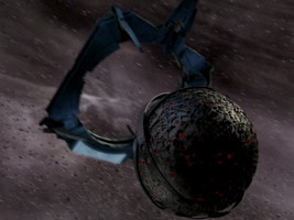
In the third season of Star Trek Enterprise, it is the goal of the Xindi (under the supervision of the Sphere Builders) to destroy Earth with a huge weapon probe. Before they eventually launch the full-scale probe in ENT: "Azati Prime" with a diameter of 1.5 kilometers according to my cautious estimations, they intend to test the weapon by blowing up a moon in ENT: "Proving Ground". Except for some differences in the lighting, this prototype looks exactly like the huge final probe. This is not a big issue, and as already mentioned in the introduction, the trouble with re-used models is not discussed in this article.
The first part of the actual problem is that the prototype probe has to be extremely small because it fits into the launch bay of Enterprise NX-01. And yes, I am aware that the prototype is never actually towed aboard, but exactly that was the plan before the Andorians beat Enterprise to it. So the diameter has to be smaller than about 3 meters at any rate. The question is if the probe is powerful enough to blow up a moon, why would the full-scale weapon have to be 125 million times larger to destroy Earth? And this is still a moderate estimation of the volume ratio, taking the upper limit for the small and the lower limit for the large weapon.
Well, perhaps it is a tiny moon despite the visual evidence that seems show a massive ball (in orbit of a gas giant that is naturally huge)?
Anyway, there is another problem that comes to pass just because the prototype probe is so very small. The probe is delivered to the proving ground in a specially constructed and apparently warp-capable transport frame. The design looks like it is very large, with something like an inhabitable command section. To be fair, the probe and transport don't give us the impression that they are larger than a few meters in the VFX sequence in which the probe is released. Yet, the question may be allowed why this frame exists in the first place, if the probe could easily (and more safely) have been transported on one of the Xindi vessels that are present at the proving ground. Perhaps, in the real-life production, it was decided to reduce the prototype probe retroactively in size, so drastically that it could simply be transported in a cargo bay and wouldn't have needed the warp sled in the first place?
Denobulan Medical Ship
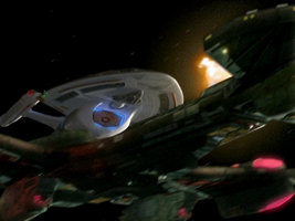
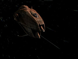
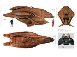
A Denobulan medical ship appears in ENT: "Cold Station 12" and is intercepted and hijacked by Soong's Augments to gain access to Cold Station 12. After they have escaped at the end of the episode, they tow the ship aboard the shuttlebay of their Klingon Bird-of-Prey. Eventually, in "The Augments", they return the Denobulan pilot to her ship, release it from the shuttlebay and drop it into the atmosphere of a gas giant.
The 22nd century Klingon BoP is itself a small ship, probably not larger than its known 23rd counterpart (although the size of the latter famously varies). It measures 115m according to my estimations. The shuttlebay as seen in the two episodes (the newer BoP has none that we know of) is 13.6m wide and 4.7m high at this scale. It would allow to hold three standard shuttles, side by side. But can the vertically oriented Denobulan ship possibly be that small? The design doesn't look like that at all. Actually, my impression is that it was supposed to have one full upper deck and a storage compartment on the lower deck. The spacious bridge set with two seats, with a comfortable ceiling height and with what looks like access to an aft section would not fit in, considering that the usable space of an only 4.5m high vessel (10cm clearance), without parts that clearly belong to the engines, is only some 1.8m wide on average and 2m tall at its highest point.
It seems that it was either decided in a late change that the ship should be towed aboard the Klingon BoP because it is more dramatic, although its CGI and set design had already been finished. Or the required tiny size and particularly the low height was never sufficiently communicated to the people who ended up designing a vertically oriented vessel with comfortable ceiling heights, adverse to what happens to it in the story.
The actual design size of the early Klingon BoP is uncertain. According to the Official Starships Collection the ship is 145.36 meters long, which would alleviate this whole issue considerably, although it is possible the size was increased retroactively.
California Class
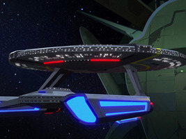
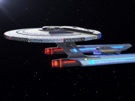
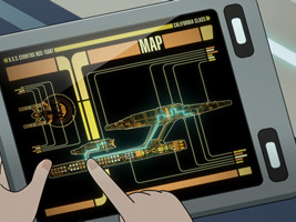
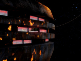
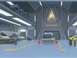
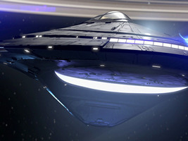
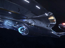
 The California class is 535.2m long, as has been confirmed by Lower Decks producer Brad Winters. This length would allow two decks in the saucer rim of the USS Cerritos. These two decks are discernible on the original MSD of the ship that is shown in LOW: "Second Contact". The exterior of the Cerritos, on the other hand, consistently shows three rows of windows. As we can see in the close shot during the Breen attack in LOW: "Trusted Sources", each of these window rows corresponds to exactly one full deck of some 4 meters height, so it is not possible to argue that windows are shared between decks. Therefore the Cerritos would have to be considerably larger (about 50% in each direction) to accommodate that extra deck. And indeed, this upscaling is exactly what happens in the book Starfleet Ships: 2294 to the Future where the ship is depicted as being 794m long - in spite of the scaling looking ridiculous relative to other designs such as the Sovereign class. Also, the MSD was revised to show three decks in the saucer edge for LOW: "Room for Growth" and "Reflections".
So was the Cerritos retroactively made a lot bigger than originally designed? Other size evidence is not quite as conclusive. The Cerritos has two shuttlebays, whose outlines are illuminated blue since season 2, probably to distinguish them from impulse exhausts. The shuttlebay interior as seen in many episodes would barely fit into the shape of the vessel if it is only 535.2m long, but we may easily imagine it is possible. We have to disregard the rows of lights just above and below the shuttlebay door because even at 794m length there could hardly be inhabitable decks. There are also several other spacious interiors on the Cerritos such as main engineering but none appear to be so oversized that they would require the ship to be overall larger. So it all boils down to the issue of externally visible decks. And even though it means to ignore the visual evidence from "Trusted Sources", it seems like the lesser evil to keep the size at 535.2m, rather than making the California class the biggest ship type of Starfleet - especially considering that it is repeatedly stated and shown to be "small" relative to other designs.
The dilemma of too many window rows is a persistent one in Lower Decks. The Parliament-class USS Vancouver as first seen in LOW: "Cupid's Errant Arrow" also has three rows of windows in the saucer rim, although that would require the ship to be roughly a kilometer long and doesn't comply at all with the MSD visible in the same episode. Well, the deck count could work if we decided to scale up the Cerritos as well. The Obena class from "First First Contact" was designed as some sort of upscaled Excelsior, so three decks in the saucer edge instead of two makes sense if the nacelles are taken from the Sovereign class, without scaling them down. On the other hand, a standard Excelsior, the USS Hood NCC-42296, can be seen in "Mining the Mind's Mines", with three decks in the saucer (besides countless extra windows in the engineering hull) as if it were an Obena class.
Protostar Class
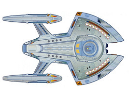
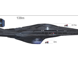
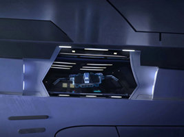
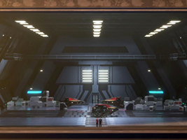
 The official design length of the USS Protostar is merely 139 meters. However, as we look at the interiors, and especially at those which need to correspond to external features, the ship has to be bigger - a lot bigger. We can see in many shots from the inside and especially from the outside that the bridge, from the very base to the highest point of the transparent dome, measures at least 6m. The 139m ship would allow less than 3m. Likewise, the cargo bay with the vehicle replicator is consistently 6m tall at the very least, with the front door measuring perhaps a bit less. If we go by the diagrams, it is more like 3m on a 139m ship. Also, the whole room would have an even floor space of just a couple of meters to the aft. And this still doesn't address the question how the massive landing gear can possibly be retracted without losing many cubic meters. Realistically the mechanism would occupy most of the cargo bay and would leave hardly any place to replicate vehicles.
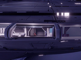
There are many windows on the Protostar, which would be just portholes even if the ship were larger and which don't seem to correspond with decks. Only the lateral gallery around the saucer rim has large windows that are clearly associated with a deck. We can see Gwyn and Jankom standing here in "Time Amok", and once again they are only half as tall as they would be if the Protostar were the original design size. The scaling of the interiors is quite consistent, and quite consistently shows a ship that is twice as long (with eight times the volume).
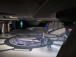
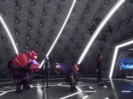
In addition to these numerical scaling issues, the question is where the many spacious rooms like the foyer, the brig, the holodeck or the mess hall could be located. Or the the room where the Vau N'Akat weapon is hidden. Also, Jankom Pog's engineering is quite large, considering that the rear 40% of the ship are occupied by the solid protostar drive (including a mechanism to unfold this section and open it to space). So is the Protostar actually 280m long?
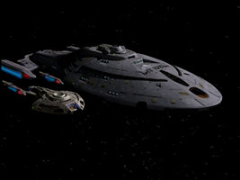
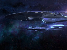
Relative to other ships and structures, on the other hand, the Protostar usually looks very small, most notably when it appears in front of the Dauntless (which, according to some accounts, is the same order of size). So unless we postulate that the reference ships are a lot bigger than we thought (which we really shouldn't), the Protostar is indeed 139m long on these occasions. There is no satisfactory solution to the whole dilemma yet. Considering that the shots of the bridge or the cargo bay as well as the question how everything could fit into the ship are more prominent than the comparisons with other vessels, perhaps the size should be revised to 280m.
Dauntless Class
 The original USS Dauntless NX-01-A appeared in VOY: "Hope and Fear" and was a fake Federation starship with quantum slipstream drive created by Arturis to take revenge on Janeway and her crew for the assimilation of his people. In PRO: "A Moral Star II", we see an actual Federation ship of that name and with the registry NCC-80816 for the first time, also equipped with slipstream propulsion. The design is almost the same at the first glance, the only prominent difference being that there is a kink between the saucer and the engineering hull now instead of the formerly smooth transition. The more or less official rationale (albeit just mentioned behind the scenes and not on screen) for the similarity is that Starfleet reverse-engineered the alien vessel based on the data that Voyager could collect. However, exactly reproducing the bridge of that ship is preposterous, especially since it was only a fake version of the actual alien command center. An alternative and arguably better theory is that Arturis somehow got his hands on plans of a real Starfleet project with a new propulsion technology, of what would become the USS Dauntless NCC-80816. So his design may be a Starfleet knock-off, rather than the other way round.
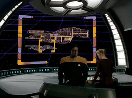
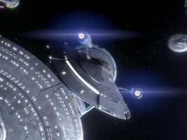
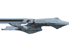
In any case, the USS Dauntless NCC-80816 is not the same class and is not a variation of the USS Dauntless NX-01-A. It is an entirely new, much bigger design that adopts its propulsion technology and merely takes some design cues, whether we believe in the story of it being reverse-engineered in its entirety or not. There are clearly many more decks than on the ship created by Arturis, as indicated by the window rows. We can see very well how large this Dauntless is in comparison to the Protostar (whose size is debatable as already discussed, but which has to be considerably longer than the intended 139m, if anything). The ship from VOY: "Hope and Fear", on the other hand, had eight decks, as can be seen on the MSD of that ship. It was only some 150m long, the same order of size as the Protostar (or a lot smaller, if anything). So far, so good.
Yet, the MSD created for the new Dauntless NCC-80816 looks just like the one of the fake ship NX-01-A, with eight decks and with overall much the same interior arrangement. This is physically impossible. Maybe the much larger size of the new Dauntless was established retroactively in the real-life design process, but the exterior looks rather like the upscaling was the original intention. The MSD that is essentially taken over from the small fake ship could be a failed attempt to make more sense of the "reverse engineering" back story of this class. But most likely it is the result of a mere misconception or wrong assumption, because of common sense. If two ships look almost the same, why should they be different sizes? Fortunately, it is an error we are allowed to ignore because the MSD is not all that prominent. Still, I bet most fans are convinced the two different ships are the same size because it seems so obvious and because many reproductions of the faulty MSD are already floating around.
Lamarr Class
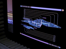
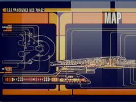
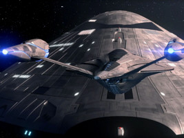
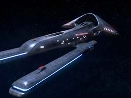
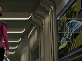
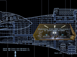
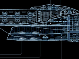
 USS Voyager NCC-74656-A, Lamarr class, debuts in PRO: "Into the Breach I" as Admiral Janeway's new command. Design-wise, the ship uses some familiar elements from the original Intrepid-class Voyager NCC-74656, such as the dorsal saucer sensor array and the deflector dish, and some more from the Protostar, whereas overall it looks similar to the Sovereign class. It also becomes clear that it is about the same size as the latter. The MSD of the ship is visible in several episodes and shows 24 or 25 decks, making the ship around 720 meters long. Well, in "Into the Breach I" Voyager-A is stated to have 29 decks, and in "Into the Breach II" there are suddenly 32. Aside from this embarrassing mistake, there are some more serious problems with the scaling.
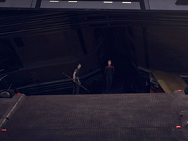
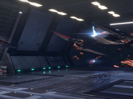
The problem with the number, sizes and locations of the shuttlebays on Voyager-A is a headscratcher. The ship seems to have two official shuttlebays, considering that "shuttlebay 3" is the secret place where the Infinity is stored, as mentioned in "Into the Breach I". The MSD shows just one recognizable shuttlebay at the very aft end, stocked with standard-sized shuttlecraft, each of which is around 10 meters long. These shuttles look like smaller versions of the huge type we see all the time in the second season of Prodigy - although they may be supposed to be the very same. The size of the shuttle is a problem of its own. Anyway, this aft shuttlebay is never visible once and apparently never used, although shuttles and other small vessels depart and arrive all the time. The reason may be that it is just way too small. All shuttlebays that we actually see (if there is more than one) are enormous in size and have lateral outer doors.
The Infinity is explicitly kept in the secret "shuttlebay 3", which is located behind the main deflector dish, as we can clearly see in "Into the Breach II". The Nova Squadron fighters are arguably too large for the main shuttlebay and also launched from somewhere else in "Ascension I". And regarding the "standard shuttle" (actually rather: runabout), we can see how they are stored and exit the ship from an accordingly huge shuttlebay in "The Devourer of All Things II".
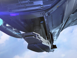
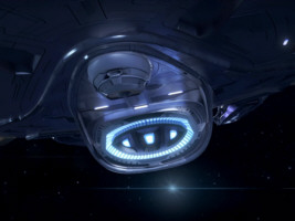
All these large shuttlebays look the same with their hexagonal cross-section and may be meant to be the same. This alleviates the problem of fitting it into the ship, although the question is what could be so secret about "shuttlebay 3". It is still possible that there are symmetrical large port and starboard shuttlebays just behind the deflector dish, of which the one on the port side, "shuttlebay 3", is a secret for some reason. On the other hand, the engineering hull just isn't wide enough for such shuttlebays on both sides. In any case, the solid wall opposite to the opening to space indicates that it is not a through-deck shuttlebay, although this too would help a bit to fit it in. As for the size of this shuttlebay, it is consistently at least five, but more likely six decks tall when viewed from the inside in various episodes. We can see it from the outside in "Into the Breach II", where the outer door (which covers the whole cross-section) is more like two decks high and too small for the Infinity (about 7.5 meters tall) to pass through. On the other extreme end of the scale, a shot from "Ascension II" shows the shuttlebay with a height of as many as eight decks, which is totally impossible to be located anywhere on Voyager-A (especially because the outer walls are straight, with no hull curvature).
There is no satisfactory solution to the shuttlebay dilemma, as we certainly don't want to increase Voyager-A to 1.5 kilometers. Perhaps we should simply accept that the small, reasonably sized shuttlebay was not used at all and that there are one or two much bigger ones somewhere on the ship, whose size is exaggerated in "Ascension II" and which for some reason are not recognizable as external features when the doors are closed. Maybe the doors are cloaked? Also, like on the original Voyager, there have to be additional spacious storage facilities for the shuttles that are currently not in the launch bay.
Finally, Voyager-A (like the Cerritos) includes a cetacean ops, which is featured in "Observer's Paradox" and is home to the humpback whale Gillian. While the facility is large and may occupy much of the center of the ship, it doesn't really nearly enough space for Gillian, who likely measures 15 meters in length. All she can do is swim in a circle all the time - much like George and Gracie in "Star Trek IV: The Voyage Home". At least, we can assume she volunteered for it. And for what it's worth, according to the MSD the whale tank is located just where shuttlebay 3 should be according to visual evidence from "Into the Breach II". Cetacean ops would have to be still considerably smaller in order to allow a multi-deck shuttlebay behind the deflector.
Voyager-A Shuttle
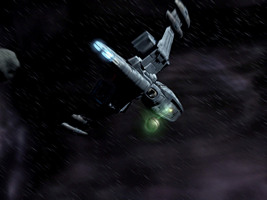
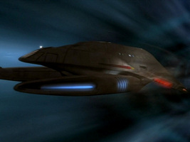
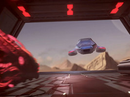
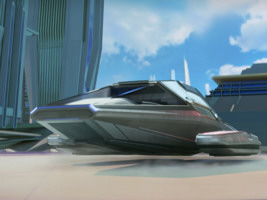
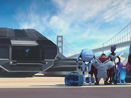
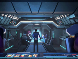
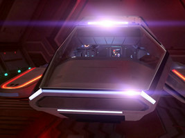
 A new shuttle type debuts in PRO: "Supernova II" and is used throughout the second season of the series as the Voyager-A standard shuttlecraft. The lines of the design with the extremely long sloped windshield are clearly inspired by the Type 9 of the original Voyager NCC-74656, only somewhat more angular now. Yet, almost all visual evidence points to this new design being at least the size of a runabout, in stark contrast to the very crammed, less than 9m long original shuttle. With a runabout measuring 23m, the streamlined Voyager-A shuttle would have to be more like 30m long to fit in the interior. The exterior shot with the EMH stepping out establishes that it is over 12m wide and probably two decks tall. The windshield measures around 50 square meters at this scale (with visual evidence being available in "The Devourer of All Things II")!
Most importantly, such a monster shuttle would hardly fit into a standard shuttlebay. The MSD of the Lamarr-class Voyager-A, which can be seen in several episodes, accordingly assumes a reasonably sized design, whose outline looks exactly like the huge new shuttle but measures only some 10m to 11m. Well, the design of the Lamarr class has problems of its own, as the deck count keeps changing and there is indeed at least one enormous Discoveresque shuttlebay as it can't possibly exist on the ship. But the root cause of the whole shuttle problem is not the Lamarr design and not the MSD. It is the upscaling of a recognizable standard design to a totally unreasonable size, without taking into account that features like the sloped windshield would be ridiculously large, and without allowing it to use normal shuttlebays - which is the whole point of standard shuttles.
We may still argue that the monster shuttle is indeed some kind of runabout. It is meant for long distances; it may not be built to land in shuttlebays and may be stored elsewhere on the quite large USS Voyager-A, not depicted on the MSD. The Sacagawea, a shuttle of the same design, is called a "diplomatic ship" in PRO: "Temporal Mechanics 101". We may imagine there is indeed a scaled down version that looks the same and can use the ship's shuttlebay. In fact, when we last see the design, it is piloted by Chakotay, lands in Janeway's garden and looks like standard-sized on this one occasion - well, until we pay more attention and spot Chakotay's tiny head behind the cockpit window! All in all, the existence of a smaller shuttle that looks the same is mere speculation.
Overall, in this case, the one of the Dauntless and the following one of the Titan-A (all from more recent Trek series), a "design homage" led to scaling errors, probably because the traditional and the customarily bigger new size were mixed up.
Constitution III Class
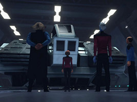
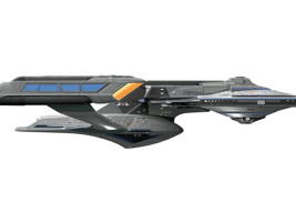
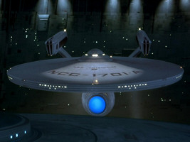
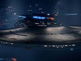
The real-life design of the USS Titan NCC-80102-A (later renamed to USS Enterprise NCC-1701-G), Constitution III class, as it appears in PIC season 3, is derived from the Shangri-La. The Shangri-La is a 23rd century fan creation by Bill Krause at the same technology level as the Constitution refit, using many of the same components. Doug Drexler and Bill Krause redesigned the Shangri-La for Star Trek Picard. They replaced the old-style nacelles with the more appropriate design of the ones on the Sagan class. They changed many details, but kept other essential features the same. The saucer of the Titan-A still looks almost exactly as that of the Constitution refit. Even the window shapes, sizes and placements and the phaser turrets are identical. Considering that the new ship is 560.5m long, as opposed to the merely 300m of the Shangri-La, these anachronisms make even less sense. The size difference precludes the possibility that for some reason an actual old saucer was used for the Titan-A. So why in the world would particularly the windows be in the same places, although the arrangement of decks and rooms just can't be the same, owing to the technological progress and most importantly to the increased size? The real-world reason for the Titan-A to have a saucer that looks just like one of a 130-year-old ship is to re-enact the "escape from Spacedock" from "Star Trek III" (complete with a variation of James Horner's famous music) in PIC: "The Next Generation". But there is no in-universe rationale, unless Starfleet subordinated function to form for the sake of a homage.
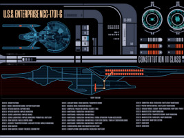
There are further issues with the naming, the design history and the back story of the Titan-A, which I comment on elsewhere. Regarding the scaling issue, we could try to fit in decks and make sense of the design. An MSD of the ship was never clearly visible in any episode, but Dave Blass posted a graphic that shows three decks in the saucer rim instead of two on the Constitution refit. Considering that the overall height of this edge is 11m, it would allow reasonable deck heights for these three decks. But the two window rows would all be located between decks, or at the very top and the very bottom of the middle deck. Well, maybe the crew just isn't meant to look out of windows, except when they are working in the engineering hull. Sarcasm aside, the only way the windows could make sense is if the deck structure around the rim were different (which is not reproduced on any of various official or fan-made MSDs I have checked out).
There is still one more problem with the upscaling that is less noticeable but can't be simply discussed away. On the original Shangri-La, the docking ports in the neck and saucer were sized like on the Constitution, with a diameter or height of 2.8m. Just like the windows, their relative size was not adapted, meaning they are now 5.1m tall. This is way off the established standard and also raises the question how the small travel pod with Picard and Crusher could dock to the Titan-A in "The Next Generation".
Discovery Rollercoasters
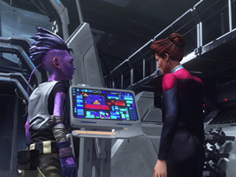
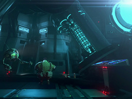
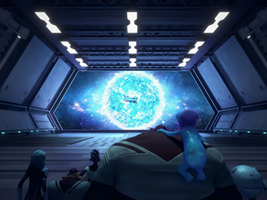
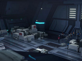
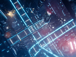
 This list wouldn't be complete without the ridiculous ship interiors created for Discovery (and for the Discovery-themed SHO: "Q&A"), all of which are not just physically impossible but also come with a plain stupid layout. It all starts in DIS: "Brother" where we see the regular network of turbolifts on the Discovery for the first time. Instead of running horizontally or vertically through inhabitable decks, between cargo bays or tanks, they form an erratic maze in a ship interior that is otherwise almost completely empty! There are even workbees flying around. The shown interior is so large in all three spatial dimensions that it just wouldn't fit in the ship, even if we assumed for a moment that it was really a void without any provisions for the crew, for equipment and for supplies.
The same episode shows the four separate launch channels for the four landing pods, which too run like a rollercoaster with many curves apparently all around the ship. This absurdly complex and enormously space-consuming network serves no other purpose than to launch those pods, which will never be used again. It is not explained why the pods can't be accelerated with moderate effort, such as with linear motors or with normal thrusters.
SHO: "Q&A" re-uses the visual style of the rollercoaster turbolift, which can also be found of the Discoverse Enterprise now (but not any more in SNW because apparently someone finally realized it was bonkers). It even has story relevance because Number One and Spock can only be rescued by someone climbing the rollercoaster rails, whereas on a normal, sensibly designed Trek ship someone would just need to go up or down at most half a deck.
The culmination of insanely scaled up interiors is the city inside the Discovery in DIS: "That Hope Is You, Part 2", now with a network of free-floating turbolifts that stretches a couple of kilometers through empty space with building-like structures.
See Also
Starship Scaling - about starships that look the same but are (supposed to be) of different sizes
The New Enterprise Design - my two cents on the redesign in "Star Trek (2009)" and its true size
Defiant Problems - Just how little is the tough little ship?
The Bird-of-Prey Size Paradox - one, two or even more sizes?
Size of the Dominion Battleship - Does the 5km version really exist?
Credits
Stage 17 plan from Star Trek Stages History, Voyager-A MSD from Dominique Rossier, Enterprise-G MSD by Mike Overton. Thanks to @StarfleetDesign for spotting the issue of the promenade window segments.

Back to Starship Articles index


 Galileo 7 interior in TOS: "The Galileo Seven"