All Starfleet Uniforms Ranked
14Discovery seasons 1-2

The blue USS Discovery uniform (ca. 2239-2258) is my least favorite style by a wide margin, for several reasons. First off, it is a one-off style that shouldn't exist at all in the timeframe. Secondly, its aesthetics don't work. With the matching colors and patterns of the shirt and the pants it looks as if a jumpsuit was cut apart. The asymmetric collar is distracting. It is overdecorated with metallic stripes, consisting of small Starfleet arrowheads. Finally, it is very hard to tell apart departments because the three metal colors may look almost the same, depending on the lighting.
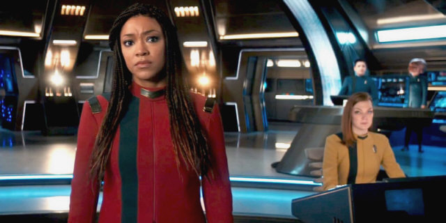
13Discovery season 4

New season, new uniform. I appreciate the (unexplained) return of the classic colors in "Kobayashi Maru", but these were already included in a much more decent fashion in the extremely short-lived uniforms from the season 3 finale "That Hope is You, Part 2". I think Discovery should leave the colorful style to the series taking place in the past. And the uneven halves of the jacket, just as on the preceding uniform, still look awkward. The dress uniforms introduced in the same episode look so much better but are not the subject here.
12Star Trek Enterprise

The uniforms of Earth Starfleet were seen in the 2140's and 2150's. While the higher-ranking officers such as Admiral Forrest wore pants and jackets, the starship crews could be seen with jumpsuits. I like how this establishes a visual distinction from the series taking place in later centuries. I can also understand that jumpsuits are more practical for the daily business on the ship. But the crew didn't seem to have anything more formal. Seriously, you don't welcome alien ambassadors wearing a jumpsuit!
11USS Relativity

Here is a little-known uniform. It could be seen only in VOY: "Relativity" and was worn by the crew of the Relativity in the 29th century. It is a reasonable extrapolation of how a future style could look like, but not particularly innovative or otherwise interesting.
10Discovery season 3

Many variations of 32rd century uniforms can be seen on Star Trek Discovery since the third season, all consisting of combinations of white and different shades of gray. The most consistent style is the one from "That Hope is You, Part 2", with added department colors for the crew of the Discovery. It looks modest, and is traditional without being too similar to the styles of previous centuries. Alas, while the ugly asymmetrical collar is gone for good, the new uniform jacket comes with uneven halves and looks like it is wrongly buttoned. The style is abandoned anyway, right at the beginning of season 4, in favor of something more colorful.
9Strange New Worlds

No, not again! Strange New Worlds comes with yet another uncalled-for uniform variation for the mid-23rd century, one that is neither close to TOS nor to "The Cage". But it looks pleasantly unpretentious. While it includes an unnecessary Starfleet branding on the shoulders, I am glad they got rid of the Discovery-style asymmetric collar!
8Star Trek: The Motion Picture

The uniforms seen in the first Star Trek feature film, set in 2271, have not aged well in my view. The cut just cries "1970's", and the colors are very pale. Yet, I sort of like the palette. The people in charge of "Star Trek: The Wrath of Khan", on the other hand, were not fond of the style at all and created a radically new uniform with red jackets for the second movie.
7Star Trek: The Wrath of Khan

This uniform first appeared in "Star Trek: The Wrath of Khan" and could be seen in all following TOS movies, as well as on TNG. In-universe, it appeared from 2278 to about 2350, making it the by far longest-lived known style - although it is the most unusual one. I personally don't think the oversized lapel is very practical, and the style also has a too militaristic semblance. The uniform appears without the shirt collar and the belt in the last few decades (such as in TNG: "Tapestry"), and this looks like essential components are missing.
6The Cage, TOS, Star Trek (2009) & DIS season 2

This group of uniforms comprises a number of similar styles, with the classic TOS uniforms (2268 to 2271) being the best-known and also my favorite example. I'm not so fond of the pale color palette from "The Cage" (2250's). The Kelvin version from "Star Trek (2009)" (2258) and "Star Trek Into Darkness" (2260) is acceptable as a homage to the original but is overdesigned with its arrowhead pattern branding. Finally, season 2 of Discovery adds a revisionist version that just does not look good with the asymmetric collar.
5USS Franklin

This uniform could only be glimpsed in flashbacks and in personnel files of the USS Franklin (2164) in "Star Trek Beyond". I like the style because it looks much like the traditional Federation Starfleet uniforms but still has some elements from the Earth Starfleet jumpsuits (such as zippers and large ship patches).
4TNG/DS9/VOY future, USS Kelvin & Beyond

I have combined uniforms from very different eras and universes in this list item, which all have in common the single-colored uniform shirt, without a black collar and without decorative elements (except perhaps for a thin stripe). The first example of such a clean style was first seen in TNG: "All Good Things" (2395) and then appeared in other alternate future scenarios of DS9 and Voyager. Similar shirts could be seen on the USS Kelvin in "Star Trek (2009)", set in 2233, albeit with department colors that were permuted for no good reason. Finally, single-colored shirts were also worn by the Enterprise crew in "Star Trek Beyond" (2263) and look arguably better than the previous imitation of the TOS style in this universe.
3TNG S1, TNG S3, Lower Decks & Prodigy 2384

Here is another group of uniforms, consisting of styles in which the shirt is colored but with a black shoulder portion. In this group, the TNG uniform since season 3 (2366-2373) is my favorite because of its simplicity (and perhaps because I have watched TNG so often), ahead of TNG seasons 1-2 (ca. 2350-2365), Lower Decks (2380's) and Admiral Janeway's style in Prodigy (2384). But they all look great.
2DS9/Voyager, PIC 2386, 2399 & 2401

When new uniforms were created for Deep Space Nine, these initially didn't replace the ones of TNG. The colors are the same, but were switched on the shirt. Additionally, there is now an undershirt. The style lasted from 2369 to 2373 (2378 on Voyager). Similar patterns can be seen on Star Trek Picard in the flashbacks (2386) and in the present (2399), with the latter looking a bit like a bad imitation of the DS9/VOY uniform. They were not popular, which may have been the real-world reason to change them yet again for season 2.
1Star Trek: First Contact/DS9/LOW

The real-world reason for the creation of this dark and almost monochrome uniform for the Enterprise-E crew was that the movie "Star Trek: First Contact" wouldn't work so well with the colorful TNG or DS9 uniforms. The new style was subsequently adopted on DS9 and is connected with the Dominion War, but without appearing as too militaristic. I understand the motivation for its creation and I like the pattern and the subdued colors a lot. My favorite Starfleet uniform!
Addendum
The USS Protostar style from PRO: "A Moral Star I/II" would deserve a top position (or it could be added to the entry for the "First Contact" uniform). As I mentioned above, uniform styles in modern Trek usually don't survive until the next season of a series, and please understand I do not intend to rework this article every couple of months.
See Also
Uniform and Rank Inconsistencies - problems with changing uniform styles, emblems and rank signs


