The Evolution of the Starfleet Medical Emblem
by Jörg Hillebrand, Brad Wilder and Bernd Schneider
HistoryShape VariationsColor VariationsSpecial VariationsOther Medical SymbolsSummaryAddendum
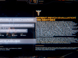
Starfleet Medical is one of the emblems that has been around for the longest time in Star Trek series and movies, surpassed only by the Starfleet arrowhead and the Klingon emblem. The symbol appeared for the first time in "Star Trek: The Motion Picture" in 1979. It was seen in all modern Star Trek series and movies, and most recently in Star Trek Discovery, Lower Decks, Picard, Prodigy and Strange New Worlds.
In the decades that the symbol is known there were surprisingly few changes. There are three slight form variations, which differ in small details, plus a recent redesign that was visible in Discovery and sometimes in Lower Decks until all series returned to the original style. In addition, it could be seen in different colors, with white being clearly prevalent. The Starfleet Medical symbol also appears on some special logos, which were often seen in just one episode. There was also an alien version and a redesign that only appeared twice. All of these variations are covered in this article.
History
In the real world, the serpent-entwined Rod of Asclepius is the traditional symbol of medicine. The caduceus, on the other hand, is attributed to Hermes and represents trade or commerce. Unlike the Rod of Asclepius, it includes two serpents and is most often adorned by wings. During the 20th century, the caduceus mistakenly came into use as a symbol of medicine, especially in the USA.
 A first medical logo appeared in TOS, here consisting of a rod with two snakes (like the caduceus), but without the wings. The logo could be seen on garments in just two episodes, "Where No Man Has Gone Before" and "Space Seed".
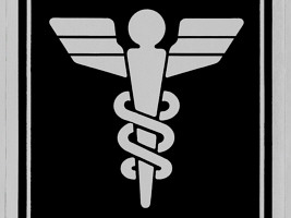
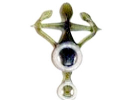
The modern Starfleet Medical emblem was designed by Lee Cole and Rick Sternbach and first appeared in "Star Trek: The Motion Picture". It is clearly not based on the Rod of Asclepius but on the caduceus, arguably because of the common misconception that it is a medical symbol.
Shape Variations
Variant 1
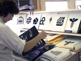
 For "Star Trek: The Motion Picture," Lee Cole and Rick Sternbach designed various pictograms to be seen on the walls and doors of the USS Enterprise. Some of these logos were also featured in later films and series, including the Starfleet Medical emblem, designed by Rick Sternbach (version 1).
Rick Sternbach: "Found the pic of me in the TMP art department. The medical logo may have been used for door signage in TMP; I'd have to go back and check out the movie. I know some of the other department logos were stuck onto some doors (see also Lee Cole's sticker book from back in the day; at least 1/3 of the art in the book was my stuff). Of course, the medical logo was heavily used in TNG and other "modern Trek" shows in display panels and as labels on props and set pieces. The original 1978 art was rapidograph technical pen ink art on hot press illustration board, and later recreated in Adobe Illustrator.
The final green-lighted version is the one on the bottom and another unused version is on top, yes."
In the end, this first emblem only appeared in the form of uniforms of medical officers. The main difference between the three form variants is the lower third of the two wings. On variant 1, the lower third is medium high and the outer lower edges are rounded. The basis for the reconstruction of the logo is a scan from the Star Trek Peel-Off Graphics Book, which was published at the same time as TMP and contains many logos from the film.
Almost all caducei that appear in Star Trek have in common that the two snakes wind around the rod in the form of a left-handed double helix (unlike the DNA, which is right-handed). When we see a right-handed helix in Star Trek, it is usually the reverse of a window emblem.
Variant 1 is by far the most frequently seen in later Star Trek series. For example, at the beginning of the second season of TNG, the emblem appears on the windows of the chief medical officer's office in sickbay. Only since the end of Voyager and the beginning of Enterprise, another variant prevails.
Variant 2
 Variant 2 is characterized by two much higher lower sections of the wings. In addition, the lower outer edges of the lower third of the wing are angular. The basis for the reconstruction of the logo is a scan from the Star Trek Sticker Book.
For the first time, this version of the logo is seen as the infirmary sign on Deep Space 9's Promenade. The logo was part of the set from the beginning, but we did not get to see a really good close-up until "The Begotten". Here we can see that the logo in the door sign has a certain 3D frame effect. In order for the rather narrow lower section of the wings, like the rest of the logo, to have such a "3D frame", it may have been necessary to enlarge this section, which eventually led to the redesign of the logo.
The next notable appearance of this version of the logo is in "Endgame", outside the building of the Starfleet Medical Center. In Star Trek Enterprise, version 2 can be seen exclusively. The logos at the door to Dr. Phlox's sickbay are most significant.
Variant 3
 Variant 3 of the emblem can only be seen in one episode, namely VOY: "Flesh and Blood". When the Doctor uses a desktop monitor in the sickbay at the end of part 1 of the double episode to contact Iden, it briefly pops up on the monitor. The variant is characterized in that the entire logo is much narrower than in all other appearances. It was compressed horizontally. In addition, however, it is noticeable that the lower third of the wings is even flatter than in variant 1 and thus significantly flatter than in variant 2. These surfaces thus look almost triangular. As already mentioned, this is a one-off version that would never appear again.
Variant 4
 After no medical emblem had appeared in DIS season 1, variant 4 with the wing tips pointing up can first be spotted in the Short Treks episode "Calypso". In season 2 of Discovery, we can see this variation, now without the ring around it, a couple more times. Finally, this medical emblem prominently appears on the sickbay doors of the USS Cerritos in Lower Decks. After that, all Star Trek productions returned to the classic emblem with horizontal wings.
Color Variations
White variations
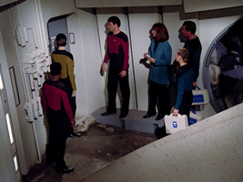
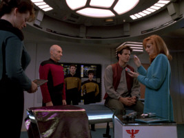
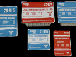
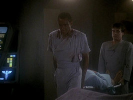
 The by far most common color combination is an emblem in white on a dark background. This is how the logo appears on numerous medical devices and containers since the first season of TNG. Starting with the second season of TNG, the logo can also be seen on medical trolleys and on the windows to Dr. Crusher's (or Pulaski's) office in the sickbay. It is also visible on Doctor Crusher's new first aid case, as first seen in "I, Borg".
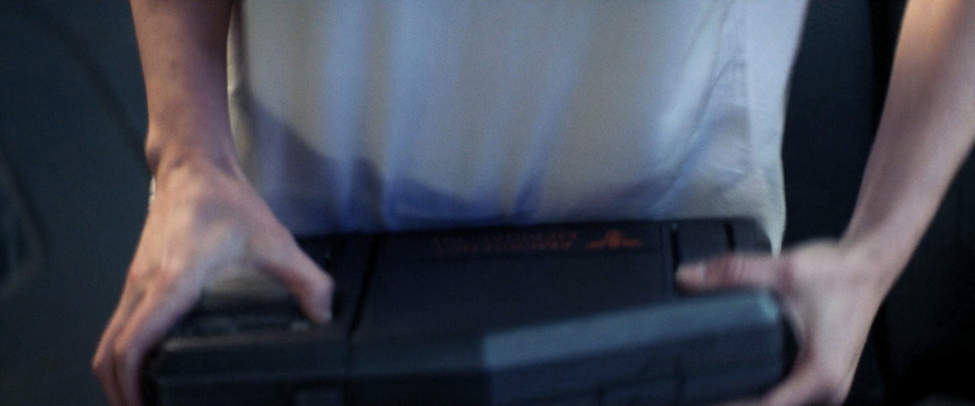
In DS9, the white Starfleet Medical Emblem appears in some episodes on the back of a PADD. In Voyager, the Doctor also has a small medical device on which the logo is printed. In Enterprise, too, the white version of the logo can be seen on the doors to the sickbay and on the large medical monitor. In episodes like "Impulse" we can see that the logo has been placed on both sides of the glass. In "Star Trek Nemesis" it appears in white in the sickbay of the USS Enterprise-E and in a cut scene that shows Dr. Crusher at the headquarters of Starfleet Medical. Without a direct medical context, the logo can be seen on the bridge of the hospital ship USS Pasteur.
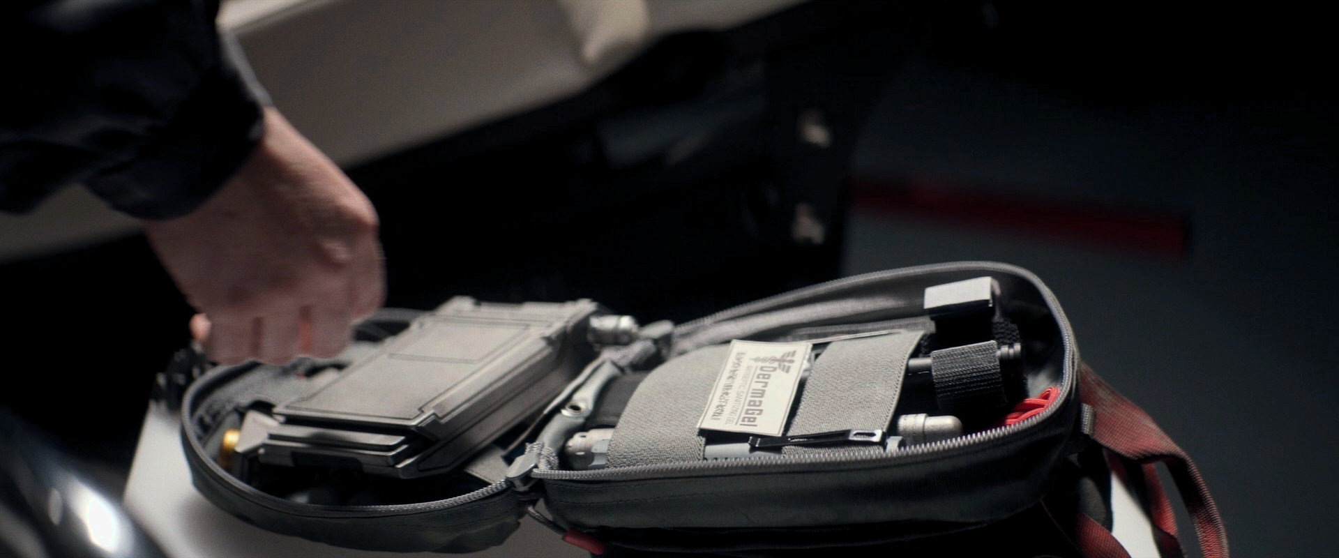
A big white emblem on a medkit case, just as it could be seen several times on TNG, also appears in PIC: "The End is the Beginning". Many white emblems, on different backgrounds, can be seen on the cargo containers in PIC: "The Star Gazer". White versions also appears in several places in PIC: "The Next Generation" and "Disengage", such as on an honor plaque on the Eleos and on a screen on La Sirena. In PIC: "Dominion", there is container with the white logo in the sickbay of the USS Titan.
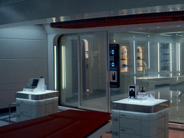
 The original Starfleet emblem (not the Discovery variation) is used on the USS Enterprise in Star Trek: Strange New Worlds. It can be seen on glass doors, infusion bags and medical supplies, usually in white.
 The same variation also appears on the screen of a medkit in PRO: "All the World's a Stage".
White-on-blue variations
 Relatively often the logo can be seen in white on a blue background. For the first time, it appears like that in "Star Trek III: The Search for Spock" at the Spacedock Bar. Large versions of the logos that were created for the first Star Trek movie (and that were added to the Star Trek Peel-Off Graphics Book) were built as wall decorations, all on a blue background.
In the TNG episode "Hide and Q" a sticker in this color combination can be spotted on a medical suitcase. The size and shape of the frame are the same as the one in the book mentioned above. The last TNG episode, "All Good Things", shows the white logo on a blue background on the doors of the USS Pasteur. Several suitcases, originally created for TMP and reused in TNG, received new stickers for TNG's season 6, which also featured the logo on a blue background. Also, in DS9 (here especially on infusion devices) and Enterprise numerous medical containers sport the white logo on a blue background.
Black variations
 Only in the first season of TNG, and only on one suitcase, we can see the logo in black.
Black logos, however, will return repeatedly in Star Trek Picard, more than 30 years later. We can spot them on two medkits aboard La Sirena. The one in "Et in Arcadia I" is likely a few decades old (judging from the hypospray), dating back to the time of TNG or earlier. Black emblems also appear in PIC: "Disengage".
 Black variations show up in various places in the field hospital on D'Gal in SNW: "Under the Cloak of War", such as on the tents and on the body bags.
Red variations
 The logo in red is seen on two medical trolleys since the beginning of the second season of TNG until the end of the series. The logo also appears in red on medical supplies (which have not yet been identified on screen so far).
30 years after TNG, another red variant can be seen in PIC: "Et in Arcadia II".
 There is a red variation on a screen in the field hospital on D'Gal in SNW: "Under the Cloak of War".
Green variations
 In green, the logo was seen as a patch in "Star Trek: The Motion Picture". As already mentioned, this is the very first appearance of any form of the logo.
 Medical emblems on Starfleet cargo containers in Strange New Worlds are bluish green.
Blue variations
 The logo is seen in deep blue on the hull of the USS Pasteur and on a large medical container in Phlox's sickbay in "The Expanse".
Orange variations
 When the Enterprise-D sickbay set was converted to the USS Enterprise-A's for "Star Trek VI: The Undiscovered Country", two medical logos were placed on the doors of the medical lab to the corridor outside Crusher's office. In the scene in which Valeris enters sickbay, these logos are visible from the other side, so the orange hue is only very faintly discernible. When the Enterprise-D sickbay reappeared in season 5, the orange caducei were still on the frosted glass panes of the door. These were not removed until the end of the series.
Light blue variations
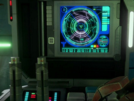
 Light blue variations appear as a part of an LCARS interface on medical consoles in the USS Defiant sickbay and on Ajilon Prime. Also, in VOY: "Flesh and Blood", variant 3 of the logo can be seen in light blue (see above).
 Decades later, displays with the same medical emblem can be seen in Strange New Worlds.
 A blue screen symbol also appears in PRO: "All the World's a Stage".
Light purple variations
 In later seasons of DS9, the consoles with the light blue logos were redesigned. From now on, the logo can be seen in light purple.
Gray variations
 In the first ("Generations") and in the last TNG movie ("Nemesis"), the logo is seen in gray in the USS Enterprise-B sickbay and on a microscope in the sickbay of the USS Enterprise-E. Also, in the Short Treks episode "Calypso", we can see the logo (for the first time in Star Trek Discovery) in a very dark gray (see under "Special Variations").
Special Variations
Star Trek II
 A presumably blue logo with a blue frame can briefly be glimpsed in "Star Trek: The Wrath of Khan" (Director's Cut). This is the first special variation, and the first time that the caduceus appears on a wall or door sticker.
Star Trek III
 Here, as mentioned above, the logo can be seen as a wall decoration in the Spacedock Bar. It is located inside a rectangle with rounded edges. The logo is displayed again in "Hide and Q", here as a sticker on a medical case.
DS9 infirmary
 A special variant with a 3D effect is the door sign for the infirmary on the Promenade. It can be seen very well in DS9: "Crossfire" (right-handed here, was the transparency inserted the wrong way round?) and "The Begotten".
DS9: Prophet Motive
 During the Carrington Award ceremony, there are two illuminated displays, on which the logo appears in a metallic 3D effect.
DS9: When It Rains
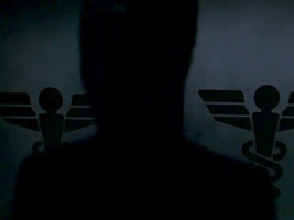
 When Doctor Bashir contacts Starfleet Medical in this episode to obtain Odo's medical data, the logo appears behind the person in charge. It is white, on a black trapezoid with a white frame.
VOY: Flesh and Blood
 Here the logo appears in light blue on a dark blue triangle with rounded corners. It is the only time we can see variant 3.
VOY: Endgame
 Outside the building of the Starfleet Medical Center in San Francisco, we can see variant 2 of the logo with a metallic effect.
ENT: Cold Station 12
 In this episode we can see the logo as a uniform patch (for the first time in many years). The special logo of Cold Station 12 also appears as a sticker on different walls and consoles. It is another rare occurrence of a right-handed caduceus.
ENT: Demons
In ENT: "Demons" a medical emblem (albeit probably not one of Earth Starfleet) is visible as a wall sticker on the Orpheus Mining Station. It appears to be a variation of the sticker that was created for the mining facility, replacing the hammers with the caduceus. It is not possible to decipher the letters on the medical emblem, even in the HD version.
Abramsverse
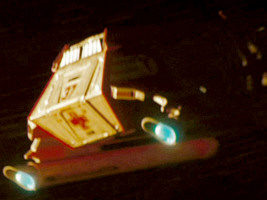
 The medical emblem is barely visible on the shuttle with Winona Kirk in "Star Trek (2009)", and only on 4k screen caps. It is probably red here, as reproduced for the Star Trek Encyclopedia IV. Geoff Mandel sketched up the shuttle with that logo, in an early stage of the production when the USS Kelvin was still to be named "Iowa".
Star Trek Discovery

 In "SHO: Calypso" we can spot the logo in dark gray (or black) on a white background in an equally dark gray or black circle.
We can also see a medical logo in various places on the USS Hiawatha in "Brother" and on a shuttle in DIS: "Saints of Imperfection". Here, it becomes clear that it is a the new variation 4, with the wing tips slightly pointing upward. The emblem seen in SHO: "Calypso" arguably looks like that too. The large emblem in "Brother" is a right-handed double helix and is mirrored relative to almost other caducei that appeared in Trek.
Lower Decks

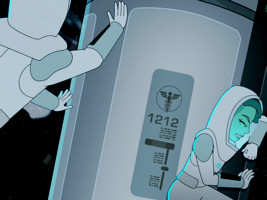
 A medical emblem in a circle appears on containers in the Lower Decks episodes "Second Contact" and "Terminal Provocations".
Cerritos sickbay

 A Discovery-style medical emblem (variant 4) shows up on the sickbay doors on the USS Cerritos in Lower Decks.
White/blue Prodigy variants

 A variation with a white or light blue symbol in a solid blue circle can be seen on a medkit in PRO: "All the World's a Stage". The same kind of symbol is also visible on the sickbay door on Voyager-A (in an alternate timeline) in PRO: "Cracked Mirror". The former has less rounded edges but maybe it was just drawn with less attention to detail.
Star Trek Picard
 The medical caduceus appears as a decorative stencil-like wall symbol in the sickbay of the USS Titan-A.
Another variant from Picard can be seen on a frosted glass panel in the sickbay of the USS Titan-A in PIC: "Imposters". This emblem has an interesting jagged outline.
Strange New Worlds
 Just as on a number of previous occasions, the symbol appears in white with a ring around it on Parnassus Beta in SNW: "Hegemony".
Other Medical Symbols
TAS: The Ambergris Element

 Even before the first appearance of a medical caduceus in "Star Trek: The Motion Picture," the TAS episode "The Ambergris Element" features an alien (Aquan) variation of the symbol.
Star Trek II
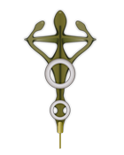 For the second Star Trek movie a completely new version of the symbol was designed. This badge was placed on McCoy's medical uniform. When the uniform was reused by an unnamed medical officer in "Star Trek V: The Final Frontier," the badge too reappeared. Except for these two occasions, the new version of the symbol was never to be seen again.
Summary
Quite unlike the Federation emblem or the Starfleet arrowhead with their numerous variations, the Starfleet Medical emblem has never undergone any significant change in 40 years of real time (or in 220 in-universe years). The four slight shape variations are only recognizable as such on a second glance. There are many color variations, though.
Just like many medical institutions of the real world, the designers of the Starfleet Medical emblem were apparently mistaken about the true significance of the caduceus, which traditionally represents commerce, not medicine. But considering the proliferation of the symbol in the 20th and early 21st century, it shouldn't be surprising if it becomes an authentic medical symbol in the 22nd century.
Addendum
Confederation
The fascist "Confederation" created by Q in PIC: "Penance" uses a medical emblem that is also falsely based on the caduceus but follows a different pattern than the one of the UFP.
Star Fleet Medical Reference Manual
On the cover and inside the unofficial Star Fleet Medical Reference Manual, which appeared in 1977, we can see another version of the caduceus. The logo was designed by Doug Drexler. The book can be seen on the Eleos in PIC: "Disengage", which sort of canonizes the logo.
NCIS
While the caduceus is a common sight for medical institutions in the USA anyway, it is worth mentioning that we can see an ambulance with the exact shape of the Starfleet caduceus in an episode of NCIS.
See Also
The Evolution of the Federation Emblem - exhaustive survey of all variants
The Emblem of Starfleet Academy - overview of its evolution and of the correctness of the motto
Credits
Some screen caps from TrekCore. Special thanks to Rick Sternbach for his comments and to Memory Alpha from where we obtained historical information.


 Rod of Asclepius (generic)


