The Evolution of the Enterprise-D Bridge
by Tadeo D'Oria and Bernd Schneider
"Real" BridgeAlternate VersionsAddendumGallery
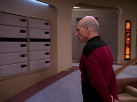
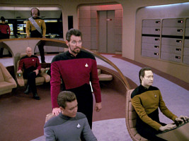
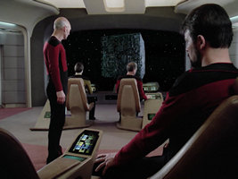
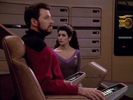
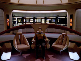
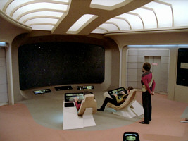
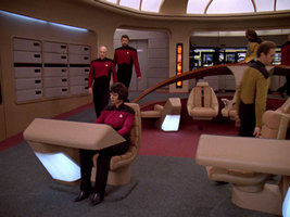
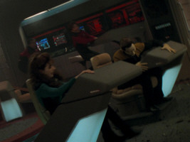
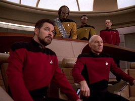
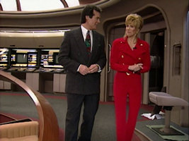
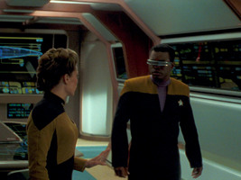
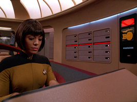
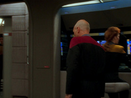
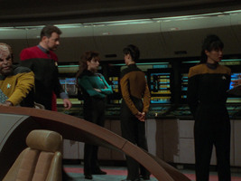
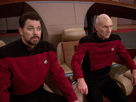
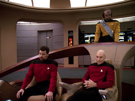
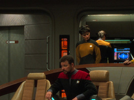
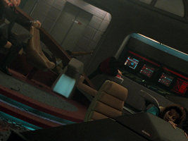
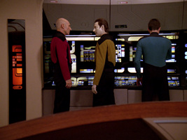
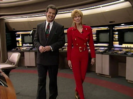
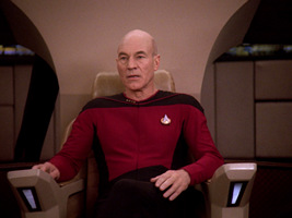
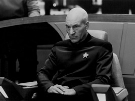
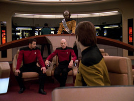
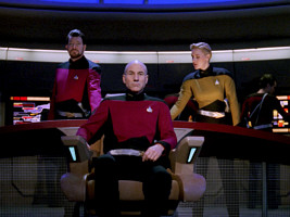
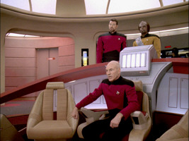
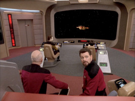
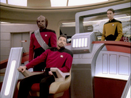
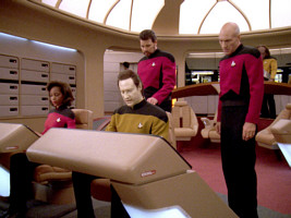
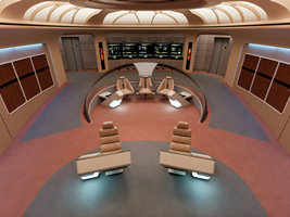
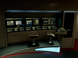
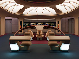
The bridge of the Enterprise-D, as seen in the seven years of TNG and in "Star Trek Generations", is one of the most famous sets ever built for a Star Trek production. While the basic layout of the doors, wall segments, stations and seats always remained the same, many details were changed over the course of the years, for the "real" bridge as well as for fake or for alternate universe versions.
"Real" Bridge
Encounter at Farpoint
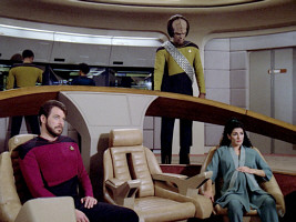
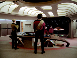
The pilot episode shows the original appearance of the bridge.
The Naked Now
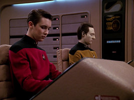
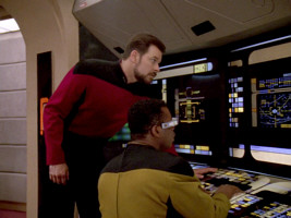
A new light strip was added above the aft consoles, providing better illumination for the actors' faces when they were seated on these consoles.
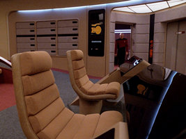
The captain's chair was slightly modified, with one small black inset added to the front of each armrest.
The Last Outpost
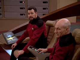
The command area was modified to add two small seats, one on each side of the already existing chairs. These new seats "disappear" again in the episode "Haven", as it was filmed before "The Last Outpost".
Datalore
The seats were further modified just a few episodes later to be somewhat smaller. Once again they change back and forth between the bigger and smaller seats for some episodes, as the filming order was very different than the release order.
The Arsenal of Freedom
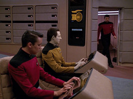
During the first episodes, most of the LCARS of the aft consoles were turned off if they weren't in use. The keyboards in particular were almost always off, even when used, leaving only a very small usable area with few buttons. From this episode forward the keyboards will always be online, even when no one is using the console.
Season 2
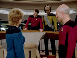
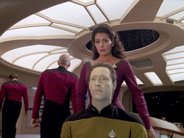
The command chairs used by Picard, Riker and Troi were changed to new designs using different coverings. Whatever the reason, they took the modify to change all three chairs to keep a more uniform look.
The wooden "horseshoe" tactical console changed color, now being a lighter color with more prominent wood veins. The middle support was also modified, now painted beige and with black and silver accents added.
The small wall behind the command area was covered with red carpeting instead of the previous gray paneling, probably to cover up the holes holding the old chair's support struts. The top end of this small wall was also raised a bit more.
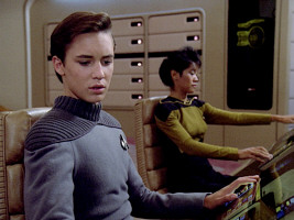
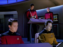
The chairs used on the Conn/Ops consoles were also modified to a new style to use the new fabrics. They are now smaller and taller, keeping the occupant in a more traditional seating position than the previous "laid back" design.
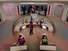
The Conn/Ops consoles themselves were reoriented. Instead of being slightly rotated inwards towards each other, they're now completely parallel to the viewscreen. The Conn/Ops consoles themselves were also modified, as a small isolinear bay was added near the floor.
The shape of the "horseshoe" was changed slightly as well where it meets the floor, to make the transition into the command area a bit more organic.
The small seats that were added on the command area halfway though season 1 were once again modified, this time completely replacing the seat with a translucent plastic of the same general shape but of no discernible use.
The circuitry access panel covers, located on each side of the bridge, were changed from the smooth wood design they had on season 1, to a more intricate design with blinking lights and pads of beige fabric.
Given the change in design of the aforementioned circuitry access panels, they were now unable to slide into the walls, so the new covers were entirely removable.
The light strip added in season 1 above the aft consoles was changed, in order to fit in more organically into the wall design.
The walls on each side of the aft consoles were now part of the LCARS of the consoles themselves, rather than simply walls as they were before.
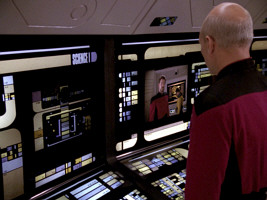
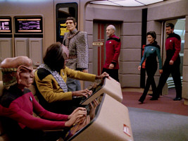
Most of the aft consoles were changed in purpose as well: "Science I, Science II, Propulsion, Emergency Manual Override and Environment" (left to right) became "Science I, Science II, Mission Ops, Environment and Engineering".
A small black border was added on the bottom edge of the aft consoles keyboard area.
The ceiling underwent some changes, with black glossy rectangles added around the central dome, and the lighted segment directly in front of said dome removed.
One of the "ribs" of the forward area of the ceiling got removed between seasons. There are only five ribs now, instead of previously six.
Looking at it from the other side, we can also see the already mentioned aft wall of the command area that is red instead of beige now, and raised.
The aft console chairs are no longer on rails, now being completely free in their movement.
A ribbed inner frame was added the main viewscreen.
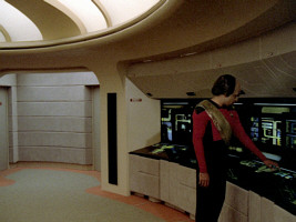
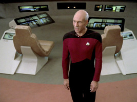
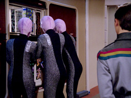
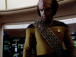
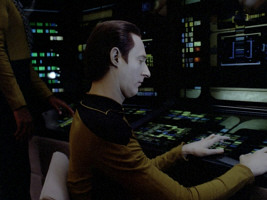
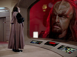
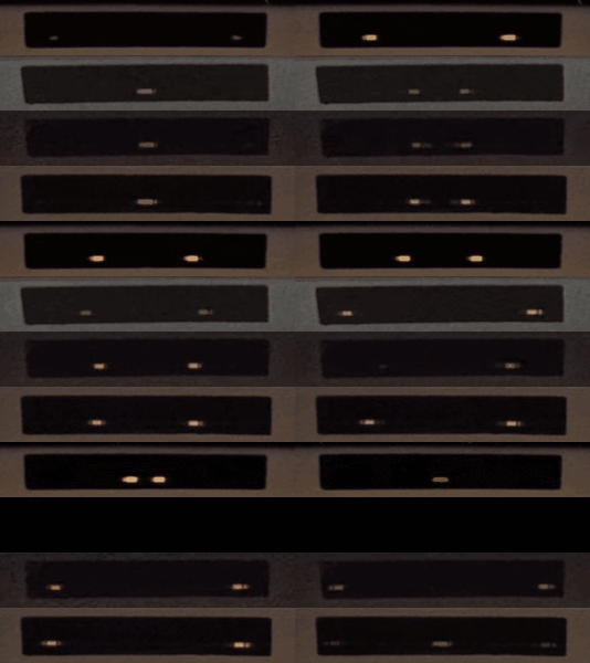
The chaser lights below the viewscreen changed their direction. In season 1, they appeared at the edge of the screen and moved towards the center. Now they start at the center and run outward. The direction will still remain the same but the speed will change slightly again in the following season. Also, in season 3 it can be noticed that one light remains dark.
The Outrageous Okona
The material of the new command chairs was changed, from leather to fabric.
The conn/ops chairs materials was likewise changed.
Season 3
Only in "The Ensigns of Command", we can see rectangular ventilation ducts in the floor both on the aft port and aft starboard side. These are gone again in "Evolution", which aired before "The Ensigns of Command" but was filmed after it.
The carpeting on the floor was changed to a different shape design.
The command area received some new small seats at each side once again, replacing the previous translucent plastic piece with much smaller but functional seats.
A new version of the captain's chair's right LCARS display appeared from season 3 until season 5's "Hero Worship". It is similar to the first version of the left display in that it features a bottom row of buttons and a frame with smaller buttons at the top.
The circuitry access panel covers were modified once again, this time keeping the design but changing fabrics, from being the same beige fabric of the seating, to the same gray fabric as the door alcove walls.
The aft console chairs received a new footprint, now having a black square one, rather than the circular gray one of previous seasons.
All the LCARS displays with the previously muted colors are more vibrant now. The translights are most likely still the same, only the lighting was improved.
The inner frame of the main viewscreen was changed. It is not ribbed any more.
The High Ground
There are new carpets, with more subdued colors, similar to those of the previous seasons.
Sins of the Father
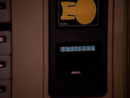
The small side panels with the dedication plaque and/or the bridge replicator were changed some time between "The Offspring" and "Sins of the Father". Rows of LCARS buttons were added to both panels. The high-gloss panels are now covered with a frame of a non-reflective material for the most part.
Season 4
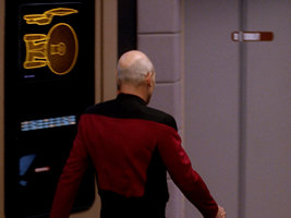
The light source behind the Enterprise-D graphic on the port panel was replaced. It is much brighter now.
The LCARS colors and shapes were further defined. This is mostly evident on the aft consoles, as the Science I station changed its design slightly, and the top LCARS area changed colors, no longer having a red element beside each station's name.
Season 5
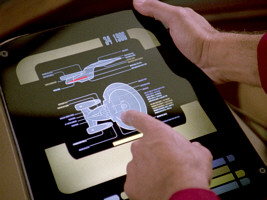
The small consoles used by Riker and Troi received a new LCARS display that shows a schematic of the ship.
The dedication plaque was switched. The new one has a completely different shape and different information on it.
The aft console LCARS were modified slightly, more noticeably the Science I station has a different color combination, adding violet at the top of the console.
Violations
The third and final right LCARS display in Picard's captain's chair appears very similar to the first (season 2) version. It consists of several rows of LCARS buttons and can still be found on the chair today as per Propstore auction photos.
The second and final left LCARS display on the captain's chair was installed before "Violations" and remained the same until the end of TNG, so it's the one seen in the Propstore auction. It's similar to the first one but now features Enterprise-D graphics inside the top frame.
The Masterpiece Society
The chairs for Ops/Conn were modified slightly, removing the padded design of the backrest and replacing it with a smooth one.
Season 6
The LCARS colors of the aft stations were changed once again. It's very apparent at the top of the panels, as the stations' names were switched from blue to yellow.
Starship Mine
The Enterprise-D graphic on the starboard replicator panel was changed. This curiously happened during the filming of "Starship Mine". When Picard enters his ready room, it is still the familiar version. When he is seen leaving again, it is the new, brighter one. This graphic will be in use until the end of season 7.
Homeward
In season 7, specifically for "Homeward", the color scheme of the LCARS aft stations was changed yet again. More of the blue elements were replaced with yellow ones.
Star Trek Generations
The small platforms on which conn and ops sit were made much taller.
The ceiling was painted a metallic copper color. Corridors and other sets on the ship also had some surfaces painted this way during the movie, and behind the scenes footage reveals that originally much more of the bridge was similarly painted, before reverting to a more classic beige before filming begun.
H-shaped struts as reinforcements were added to the ceiling. The ceiling segment adjacent to the central dome is illuminated again.
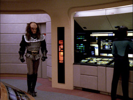
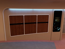
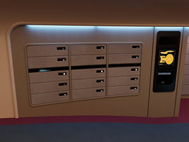
Small equipment containers were added next to the aft doors. In a deleted scene, we see Worf getting flashlights from these panels.
The order of the aft consoles was changed. Clockwise, they're now Science 4, Mission Ops, Environment, Engineering 1 and 2.
Side consoles were added, three on port (Communications 1 through 3) and three on starboard (Science 1 through 3), in the place of the former access panels.
The formerly black details (probably created with tape) on the tactical console support behind the captain's chair were replaced by a subtle extrusion with the same outlines.
Hand rails were added near all doors.
Two steps were added to the command area (actually a leftover from the "All Good Things" bridge modifications).
The aft consoles cutout and the aft door alcoves were further accentuated with cylindrical borders added around them.
The aft consoles were pushed further aft, to make the two outermost consoles the same lenght as the three in the center. This also meant the ceiling had to be extended, with a new lighting piece added behind the existing one. The floor carpet was also extended, with another ring of blue carpet following the existing red one.
The captain's chair was a new design. While intended to be identical, the new chair (allegedly built in a hurry after the previous one was stolen) has different armrests, which are slightly wider and feature different control surfaces. The lights at the front of the armrests are also bigger, lacking the black borders the chair had in the series.
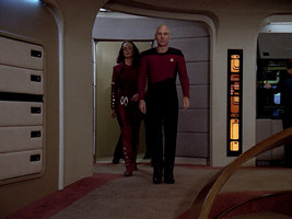
The alert status indicators on the aft of the bridge were extended to reach the floor. They were also now always lit in their entirety.
The small ship schematic near the ready room door was removed.
A horizontal line of black tape was added near the floor on all access alcoves.
A seat was added at the tactical station.
Alternate Versions
Yesterday's Enterprise
For this parallel timeline version of the bridge, all chairs in the command area were removed except for the captain's chair.
A metallic grid was added to the area under the tactical console arch.
The lower parts of the aft consoles were completely removed and replaced with access panels, turning them into freestanding wall monitors
Lateral consoles were added (here still with a different and not so organic look as those that would appear in "Generations"). The circuitry access panels were changed to LCARS displays in the upper half. In the lower half, the covers are now pentagonal and embossed, like those of the aft consoles too.
The lighting of the entire ceiling was switched to blue.
Greebles were added to most gaps between the wall panels.
Future Imperfect
This episode shows a fake future version of the bridge, in an attempt to trick Riker. Orange details were added to the tactical console, the space above the aft consoles, and all the doors.
Circuitry access panels were replaced by the "Yesterday's Enterprise" version (but without re-adding the lateral consoles).
Big orange or red labels were also added on the Conn/Ops consoles.
Parallels, version 1
This is the version of the bridge that can be seen when Worf fails to find the right button to fire on the Cardassian ship because the tactical console has changed. In order to visualize this change, the color of the whole arch was changed to red. The central part is no longer beige but silver. An additional silver box was added on top of the arch. Furthermore, the area underneath the arch was filled with a nearly opaque glass pane.
There is a new LCARS for the vertical panel at each side of the side consoles.
Also, red coverings were added on the captain's chair (seat and armrest).
The Conn/Ops consoles were painted silver gray, just like the central part of the tactical console, rather than the regular beige.
Parallels, version 2
The tactical console was further modified for a version of the bridge that appears towards the end of the episode. Compared to the previous parallel universe version 1, additional struts extend from the tactical console arch down to the command area floor. All chairs in the command area were removed, except for the captain's chair.
A large glass pane was added between the tactical console and the aft consoles.
Circuitry access panels were replaced by a new design, similar to the "Future Imperfect" version, but without the cutout for a screen in the upper area.
An additional lighted box was placed in front of the main viewscreen.
The captain's chair now sits on a raised platform that extends nearly to the viewscreen. This changes the position of the Conn/Ops consoles further to the sides.
All Good Things
Two steps were added to the command area.
The tactical console features the same additions as already in "Parallels": the central box, the two lateral struts and the opaque glass pane. The arch itself, on the other hand, remains wooden in "All Good Things".
Command consoles for XO/Specialist were removed, chairs were set further apart from each other.
Circuitry access panels have the same new design as already in "Parallels".
Beige plastic cutouts were glued onto the aft consoles.
The lighted box already known from "Parallels" was placed in front of the main viewscreen again.
Addendum
Yamato Bridge
In the season 2 episode "Where Silence Has Lease", the bridge of the Galaxy-class Yamato was created as an illusion by Nagilum, with an impossible physical configuration. The set was the unchanged one of the Enterprise-D, as it looked at the time. Only the dedication plaque was blurred for the HD release, which would otherwise have allowed to read "USS Enterprise".
For episode "Contagion", the USS Yamato made a second brief appearance before being untimely destroyed. The Enterprise-D bridge was quickly and cheaply redressed to become the actual bridge of this sister ship. Besides having isolinear circuitry scattered all over the set to illustrate the technical problems the ship was having, we can see that the backrest of the captain's chair was covered in a green fabric, clearly attached from the headrest by a couple of green stripes. The tactical console was likewise covered in this green fabric, with the same stripes being visible bordering the central column behind the captain. Finally, the captain's chair was raised significantly from its position on the Enterprise. This was likely just done using "apple boxes" in order to get Captain Varley better in frame (something that was regularly done for closeups of the standard Enterprise bridge chairs as well), however as this ended up being the only angle from which we ever saw the bridge, we can assume that the command chairs are really intended to be slightly raised when compared to those on the Enterprise.
Gallery
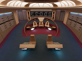
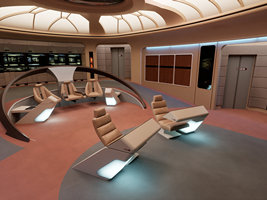
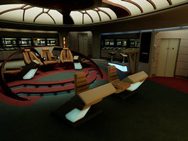
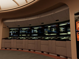
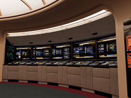
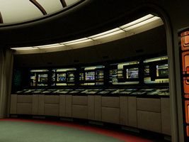
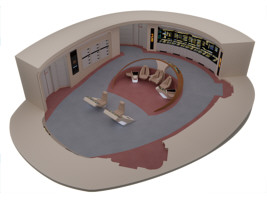
Here is a gallery of the bridge models (season 1, season 7 and "Generations") that Tadeo created for the Roddenberry Archive, rendered by Rob Bryan and with animated LCARS displays by Donny Versiga.
See Also
Galleries - Starfleet Bridge Illustrations
Changes to the TNG Sets Between Seasons 1 and 2 - several modifications revealed in screen cap comparisons
Credits
Most screen caps from TrekCore. Thanks to Lt. Washburn of TrekBBS, who spotted some more season 2 changes.


 Reconstruction of the season 1 bridge set




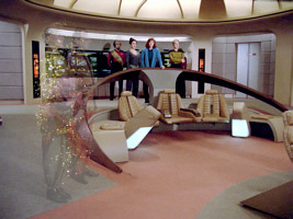

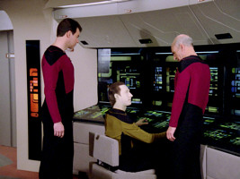
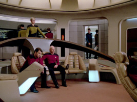
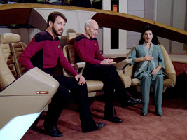








 Comparison of chaser lights in seasons 1-4 (top to bottom)