The Evolution of the Federation Flag
by Jörg Hillebrand, Bernd Schneider and Brad Wilder
Red UFP PennantBlue Official FlagsDecorative FlagsAbramsverse Variations32nd CenturyAddendum: Confederation
In the course of the different Star Trek series and films, several different flags of the Federation could be seen. In the following, we investigate all appearances of all existing variations of the Federation flag in production order. The Federation emblem (whether placed on a flag or not) is the subject of a separate article.
Red UFP Pennant
TOS: And the Children Shall Lead
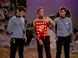
 This pennant, first seen on Triacus in TOS: "And the Children Shall Lead", is the first variation of a Federation flag to appear in chronological airing order. In this episode, the pennant is red, the stars are white, and the letters "UFP" are pale yellow. While the top of the pennant is straight, the sides are slightly rounded.
Star Trek II
 When Franz Joseph drew the banner for the Star Trek Star Fleet Technical Manual, he slightly changed its proportions. The whole design is now a bit longer and the sides are just as straight as the top. The background of the banner is still red, while both the stars and the three letters are supposed to be silver. This modified version is most commonly reproduced for official purposes and for fan art, rather than the pennant as it really appeared in the TOS episode.
The SFTM variant of the banner appeared in "Star Trek: The Wrath of Khan" in the travel pod, among other logos from the book. The edges of the banner are all straight and the letters and stars are either silver or colorless. The background is still red.
DS9: What You Leave Behind
 When Mike Okuda sketched up the pennant for the Star Trek Encyclopedia, he too based the design on the depiction in the Star Fleet Technical Manual. In the first edition of the Encyclopedia, the banner appears black and white just like the rest of the book, in the second and third editions it is red with silver letters and stars, as also shown in the SFTM. It is noticeable, however, that the upper row of 5 stars is not in the center of the banner, but is slightly shifted to the left. This inaccurate version of the banner, with white stars and letters, also appears in the Star Trek Sticker Book.
 When a peace treaty (Treaty of Bajor) was created for DS9: "What You Leave Behind", the old UFP banner from "And the Children Shall Lead" was used once again. Here, the variant with the shifted upper star row and the straight edges from the Encyclopedia was used. All emblems on the contract are in blue with a slight shadow (as in the Encyclopedia).
So two different versions of the banner that were originally only depicted in books became canon because of their appearances in "Star Trek: The Wrath of Khan" and "What You Leave Behind".
TOS-R: The Ultimate Computer
For a fourth time in canon Trek, the red pennant shows up in the remastered version of "The Ultimate Computer" on the hull of the newly added Starbase 6. Here, it can only be identified by its red color and shape. It is not clear which variant was actually used.
When the fourth edition of the Star Trek Encyclopedia came out in the fall of 2016, Mike Okuda took the opportunity to present the UFP pennant as it actually looked in "And the Children Shall Lead". The illustration of the banner in the fourth edition clearly has the rounded edges, the white stars and the (somewhat too) yellow letters. The banner is about as compressed as in the TOS episode.
PIC: The Bounty
Finally, the pennant can be seen in the background in Geordi's office in PIC: "The Bounty". It is the first time we can confirm that the proportions are like those of the original pennant from TOS.
Blue Official Flags
Star Trek II
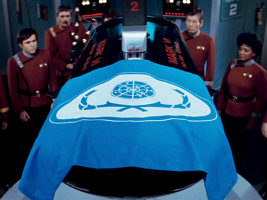
 In addition to various variants of the Federation emblem, this film also features a blue Federation flag for the first time. It is placed on the torpedo coffin for Spock's body. The blue Federation emblem, in a variation of the one already known from "Star Trek: The Motion Picture", appears in a white oval in a white concentric ring on a blue background. This first blue flag set the standard for many more variations of Federation flags. The flag would be seen on torpedo coffins in several future episodes. Also, the color combination of the Federation flag (white on blue) would mostly remain the same despite some design changes. However, the lettering "United Federation of Planets" is still missing here.
TNG: The First Duty
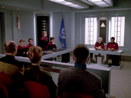
 The most famous Federation flag appears for the first time in TNG: "The First Duty". It shows the Federation emblem, created by Mike Okuda, in white on a blue background. Underneath the emblem there is a lettering "United Federation of Planets". The flag can be seen in the hearing room in the episode. The lettering is not completely visible due to the drape. The small word "of" is of special interest here. All other three words are written with capital letters. In all other appearances of the lettering in previous TNG episodes, all four words were always printed in capital letters, as "UNITED FEDERATION OF PLANETS".
In TNG, this flag was never seen again after this appearance, but in DS9 it should appear frequently.
Deep Space Nine
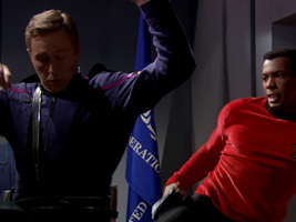
We an see the flag hanging on a wall in the video recordings of the Antwerp Conference in "Homefront". Here we can clearly make out that the word "of" is not written in capital letters. The lettering reads "UNITED FEDERATION of PLANETS".
In "Rules of Engagement", another episode of the fourth DS9 season, the flag reappears. Here, however, the drapery again prevents a look at the spelling of the word "of". The same applies to the next appearance of the flag in "Rapture", where the "of" is also hidden behind the folds.
In two consecutive episodes of season 6, the flag is completely visible again. Both on the torpedo coffin of Lisa Cusak in "The Sound of Her Voice" and on the coffin of Jadzia Dax in the next episode "Tears of the Prophets" we can see the Federation flag. In both episodes we can clearly read the words "UNITED FEDERATION of PLANETS", with "of" in lower case.
DS9: Take Me Out to the Holosuite
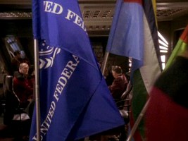
 The final appearance of this Federation flag in DS9 is in "Take Me Out to the Holosuite" during the holographic baseball game. Astonishingly, a new flag was created for this, perhaps because the old flag was not suited for actually being hoisted on a flagpole? The word "OF" appears in upper case for the first time on a flag, giving us "UNITED FEDERATION OF PLANETS", so it must have been newly created.
A "DS9 Federation flag" was sold on a Propworx auction, showing the "OF" in capital letters but with a different (larger) size of the emblem relative to the flag. Wherever this flag appeared, it is not the one from "Take Me Out to the Holosuite".
ENT: In a Mirror, Darkly II
The very same flag was already in use in the 23rd century. We can see it in "In a Mirror, Darkly II" in the ready room of the USS Defiant. Again, however, the drape prevents a look at the word "of".
Correct flag specification
- Lettering: Which version of the flag is the "official" one? The variation with "of" or the one with "OF"? The flag with the lowercase word is much more common, the variant with the capital letters can only be identified in "Take Me Out to the Holosuite". In secondary literature, however, the variant with the capital letters is preferred. Both in the Star Trek Sticker Book, as well as in the fourth edition of the Star Trek Encyclopedia, we can see flags with the capital "OF".
- Color: Regarding the colors, the version with the two different shades of blue, as it can be seen in the Sticker Book, never appears in a series or in a movie, but it can be purchased on the internet. All canon UFP flags use only one shade of blue.
- Proportions: In "The First Duty" and "Homefront" we can only guess that the aspect ratio of the UFP flag is about 3:2 (like e.g. the flag of France). The new flag made for "Take Me Out to the Holosuite" is very likely 3:2. So this ratio appears to be the only correct one. The depiction in the Star Trek Encyclopedia IV shows the flag at an elongated ratio of 2:1 (like e.g. the flag of the UK) that probably didn't appear on screen.
Abramsverse
 Interestingly, the flag variation from DS9 also appears in the Kelvin universe, besides the ones that were newly created. "Star Trek (2009)", the first film in the Kelvin trilogy, features the characteristic blue flag on an exterior wall of the shipyard in Iowa, where the USS Enterprise is being built. It can be clearly seen in HD that the "of" in the lettering is written in lower case. In addition, in front of the Starfleet Academy building we can see the well-known blue flag.
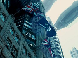
In "Star Trek Into Darkness", the well-known flag is hoisted on a building near the Kelvin Memorial Archives in London. The lettering "UNITED FEDERATION of PLANETS" can be identified. Some time later in the film there are several blue flags in front of a Starfleet building at half mast. Again, we can recognize the lower case "of". At the end of the film, another blue flag briefly appears in front of a Starfleet building during the commemoration.
Although the Federation emblem can be seen in several places in "Star Trek Beyond", the Federation flag does not appear in this movie.
PIC: The Star Gazer
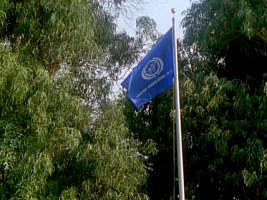
 A flag with the TNG-style UFP emblem can be clearly seen in PIC: "The Star Gazer", set in the year 2401. There is only one ring around the central seal, and it is rather thin compared to most versions that have appeared so far.
Star Trek Prodigy

 The two banners visible inside Relay Station CR-721 in 2384 come with all capital letters, like the flag in DS9: "Take Me Out to the Holosuite". But there is only one ring around the central seal.
At Starfleet Headquarters in PRO: "Supernova II", many Federation flags surround a round building (which may be Starfleet Command, whose round interior is seen earlier in the episode). These flags have a single ring around the seal, no lettering and a so far unseen ratio of close to 1:1.
Decorative Flags
Star Trek VI

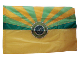
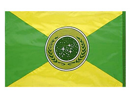
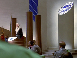
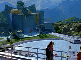
 The sixth Star Trek movie , "Star Trek: The Undiscovered Country", features a variety of different Federation flags on Khitomer, inside and outside the building. There are two flags, which are marked by diagonal lines and the colors yellow and green (instead white and blue). They are barely visible in the movie. The photos of these props confirm the permutation of the colors, which is a no-go in classic heraldry but may have been done to blend in with the flags of the other major powers on the conference choice, which too appear in unusual colors. The flag with the two diagonal lines can be seen inside the Khitomer Council Chamber, behind the Federation President. The flag with yellow on the lower half (probably inspired by the Arizona state flag) can be seen on the outside, near the water reservoir.
 Furthermore, on the outside, near the water reservoir and on the wall of the Khitomer building, there are elongated, multi-part banners, which are light blue, dark blue and white. These can also be found inside the building. These banners always have a Federation emblem in the top left corner. The logo is black and white and is located on a yellow circular background. All variants of this flag have diagonal blue lines. All flags in "Star Trek VI" are not lettered.
DS9: Rapture
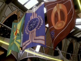
 In addition to the blue Federation flag, this episode also features a pennant with the Federation emblem and the words "UNITED FEDERATION OF PLANETS". The logo and the lettering are silver, the star background is black. Similar to the red UFP pennant, this flag has a triangular indentation at the bottom.
DS9: You Are Cordially Invited
 At the beginning of the episode, on the DS9 promenade, there is a decorative Federation banner between a Klingon banner and a Bajoran banner. The Federation emblem is placed in the center of the banner. The laurel/olive leaves are characterized by a metallic look. Behind the logo there are four broken lines, which are white inside and orange outside. The outer ring of the circular emblem is also white/orange. This flag is missing the lettering.
DS9: Inter Arma Enim Silent Leges
 Another decorative variation of the Federation flag can be seen on Romulus in "Inter Arma Enim Silent Leges". The laurel/olive leaves of the emblem have a metallic look, just like in "You Are Cordially Invited". Otherwise, the flag has the same design as the Romulan flag from the same episode, which confirms its purely decorative nature. The overall design is mirrored and the Romulan characters are different.
Abramsverse Variations
Kelvin films - cogwheel variation

 In the first Kelvin Timeline movie, "Star Trek (2009)", we get to see a new version of the Federation emblem on a flag. However, the new flag should be seen much more prominently at the end of the following film, "Star Trek Into Darkness". The emblem comes with slightly changed positions and sizes of the stars. The laurel/olive branches were also modified. In addition, there is now a gear wheel between the inner circle with the stars and the branches. Finally, this new flag is white and the emblem is blue, so the colors were reversed. It has no lettering.
We can see this flag in "Star Trek (2009)" in the large assembly hall on the Starfleet Academy campus. It is also visible outside the building.
In "Star Trek Into Darkness", the flag appears during the commemoration ceremony. It is folded up by a couple of Starfleet officers. On closer inspection, this flag is not white, but silver. In the scene at the end of the film, the flag is held with the reverse side up (or it was fabricated the wrong way round), as becomes evident by the position of the stars in comparison to the blue Federation flag and to the standalone emblem as it is visible in the Abrams movies as well. In the fourth edition of the Star Trek Encyclopedia, the orientation of this flag is correct, meaning it is the same as in classic Star Trek.
Star Trek (2009) - blue/white variation
 A final variation of the standard flag can be briefly seen in some scenes in the first Abramsverse Star Trek movie. This variant, which shows up outside the meeting building of the Starfleet Academy, is divided into two parts. The upper part is white with a blue portion of the emblem are blue, while the lower part is blue and the portion of the emblem are white. However, the inner surface of the central circle is white on both halves and the stars are blue. On the lower (blue) half of the emblem there is a narrow white stripe. For this flag, the original design of the TNG Federation emblem was used. It can not be clearly seen, but another flag inside the large assembly room has the same tripartite division (top white, middle blue, bottom with a narrow white stripe). Here, however, the center does not seem to be occupied by the Federation emblem, but by the Starfleet arrowhead.
32nd Century

 In the 32nd century, the Federation (or what's left of it) uses an emblem with fewer stars and simplified shapes, but still in the same color white on a blue flag. The flag, which "needed to illustrate a complex history in a very simplified graphic", was designed by Timothy Peel.
Addendum: Confederation

 The "Confederation" as it was created by Q in PIC: "Penance" uses a similar shield as the Federation, with only one dominant star and with a laurel branch pattern very close to the one of the UFP emblems in "Star Trek: The Motion Picture". Although the stars on the UFP emblem have no particular significance, it can be deduced that the single star of the Confederation represents Earth. The colors on the flag are black, white and red, denoting it as a fascist regime.
See Also
The Evolution of the Federation Emblem - exhaustive survey of all variants


 UFP pennant in TOS: "And the Children Shall Lead"