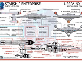
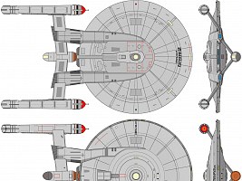
The "Akiraprise" Design
 This article is retired, as I have made my peace with the Enterprise NX-01 design.
This article critically discusses the hull design of the "Akiraprise". Since I first published my views on the design in 2001, I have received hundreds of comments, and most of them were either very positive or very negative. My opinion was even quoted in a column in Entertainment Weekly. I have decided to change the overall tone of this article that used to be very polemic at first. My apologies to the people who make Enterprise and who may have seen my criticism of their work as a personal insult. I think I have very good points why the ship is not what it should have been, and I think I don't need drastic language to emphasize that.
Enterprise NX-01 and the Akira
The mere look of a Star Trek starship model or any other prop may not be as essential as the quality of the stories, but especially Enterprise NX-01 as a vessel we were supposed to see through prospective seven seasons should have been something special and unique. I don't think that the overall exterior of the ship fulfills this requirement, at least not for fans who are familiar with Star Trek ship design.
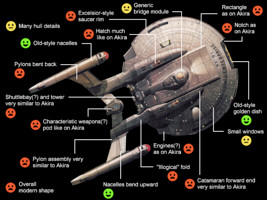
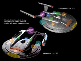
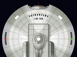
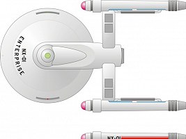
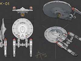
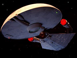
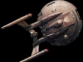
While they look considerably different from other angles, the top views of Enterprise NX-01 and the Akira class closely resemble each other like no other two otherwise unrelated vessels of the Star Trek Universe. It is undeniable that Enterprise NX-01 was much more than only inspired by the Akira class in real life. The overall proportions, the shape of the saucer (the one of the Akira being slightly more elliptical), the arrangement of the double hulls and nacelle pylons, everything is much the same. This is even more surprising as the pylon assemblies of the two ships look very different in a side view. It seems that the Akira was taken, the twin hulls bent down and the nacelle pylons bent up, while retaining their basic shapes. We may ask already now why two ships of very different eras (more than 200 years apart) and of very different sizes (Akira: 440m, NX-01: 225m) are that much alike.
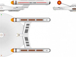
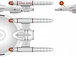
It has been objected that all the Enterprises from the original NCC-1701 to the NCC-1701-E share common design characteristics as well, namely a saucer-neck-engineering-nacelles-up configuration, and that this might be the same with the NX-01 and the Akira. There are, however, considerable differences between all of these Enterprises and their respective successors. The Enterprise-A (Constitution refit) and the Enterprise-B (Excelsior class), for instance, have very little in common except for the basic hull arrangement. The hull shapes and proportions are very dissimilar, and the sleeker look of the newer ship points to a more advanced technology. Even the Enterprise-C (Ambassador class) and Enterprise-D (Galaxy class), which are sometimes said to be much alike, share rather few features. Again, the proportions are very different and we can very easily tell which of the two ships is the more advanced one. The NX-01 and the Akira resemble one another a lot more than any two of the Enterprises, although the nacelle pylons are pointing in different directions. This would be still no problem to explain if they were ships of the same era, but they are supposed to be 200 years and several design generations apart.
Enterprise NX-01 fortunately has small windows, no visible lifeboats, no phaser strips and no transporter emitters, just as we know it from the original Enterprise NCC-1701 and should expect from a ship of the 22nd century too. Still, several details are the same as on the Akira, although they are neither the same technology nor the same size, and not even serve the same function. The way the catamaran hulls run into the saucer, the location of the weapons pod between the twin hulls, the locations of the four impulse engines, the raised rectangular area between the twin hulls and even the characteristic indentation in the saucer bow are practically identical as on the Akira. It looks like this all was retained from the very first approach to convert the Akira design to the NX-01. There is no visible evolution of the design. The silliest common feature is the strange hatch on the top of each catamaran hull. It is supposed to be a part of the plasma supercharger of NX-01, something that the Akira almost certainly doesn't have. Still, it looks exactly the same as on the Akira.
Summarizing, the similarities between NX-01 and the Akira are way too obvious to deny. Considering that even many insignificant ships that appeared somewhere in the background were given a very distinctive look, it is a shame that this wasn't possible or wasn't deemed useful for the vessel that is going to represent Star Trek for the next seven years. Doug Drexler's detail work on the NX-01 is terrific and it features some original ideas, but I would have expected just the same from the initial concept.
It may have been a "political" decision to go with the Akira because it is a proven fan favorite. As John Eaves as well as Rick Berman pointed out, the NX-01 was designed consciously with the Akira in mind. Most fans are not expected to care for starship design and to even know the Akira, which is how the design is often defended. So should the few(?) Akira fans be glad that their ship was modified and transferred to the 22nd century? If they had done the same based on a more prominent ship, let's say USS Voyager, wouldn't it be seen as justified if the fans protested against it? If it was decided at one point to take the Akira as a basis, why is the final result still so similar to the starting point? Why wasn't much more changed about the proportions? Why has the NX-01 even several details that are the same as on the Akira? Why has the NX-01 hardly any unique design features, a few things that can't be found on other (newer) ships? Why is virtually every older technology that could have made the ship look different (like the shuttle drop bay, the grappler, the sensors or the phase weapons) a hidden feature?
I firmly believe that, without any additional efforts, a really original ship with a cool old-style look could have been created remotely based on the Akira. This is proven by many alternative fan designs that take the design away from the Akira. Agreed, they are all not as detailed by far as the actual NX-01, but wouldn't they have made better starting points?
Enterprise NX-01 and the Design Lineage
We can't tell exactly how a ship from the 22nd century has to look (and I never claimed that I knew). Designing a ship to appear "more primitive than the NCC-1701" wouldn't have worked for two reasons. Firstly, the original Enterprise largely lacked surface details - because of the limited budget and modeling techniques, but also because of Matt Jefferies's idea of having everything easily accessible inside the ship's hull. There would have been no point in designing a still less detailed model for Enterprise. The second reason is that, from the 22nd to the 24th century, starship designs haven't necessarily evolved from clumsy boxes to always sleeker and more streamlined designs. On the other hand, the series was conceived as a prequel, and this setting would have required a less advanced look and feel of the ship (like of all other technology too), which the overall design of NX-01 doesn't have.
Even if it is only a subjective impression, Enterprise NX-01 looks more advanced than the Daedalus and still more recent than the original Constitution, a ship 100 years younger than the NX-01. Maybe we may have to abandon the Daedalus class, which was never shown as the real vessel but only as a model in Sisko's ready room (although I know I won't do that). But the problem of reconciling Enterprise NX-01 with the Enterprise NCC-1701 remains. If we don't look closely, NX-01 is a ship of the 24th century - even if we completely ignore the similarity to the Akira. At the first glance, just the old-style nacelles are a nice concession to the 22nd century - actually one of the few things I like about the overall design. Aside from that, only the metallic deflector dish and the small windows suggest that this is supposed to be an old ship.
Matt Jefferies designed the NCC-1701 with the idea that all equipment should be accessible from inside the ship, for it would be complicated or dangerous to service or swap out parts when working in spacesuits. This is why his creation is so smooth and has very few hull details. Later ships, beginning with Andrew Probert's revamp of the Enterprise, have pronounced hull plating and/or a deflector grid, as well as thrusters, phaser emitters, photon torpedo tubes, sensor pallets, plasma vents and (since the Ambassador) visible lifeboats. It is obvious that all these details are supposed to make the ships look more technical, and more credible when visual effects are created. What bothers me about NX-01 in this respect is that the ship has rather the typical hull details of the TNG era ships than of TOS, including an "Aztec pattern" of the hull plating. We may claim that the Enterprise NCC-1701 had at least part of these hull details too, only that the budget in the 60s didn't allow to show them. I wouldn't have expected NX-01 to look as smooth as the NCC-1701 and I don't want to go back to the visual effects of the 60s. The NX-01 needs the details. But rather than the TNG style, it should have been given a coarse and rather industrial finish with gadgets attached to the hull - suggesting that Jefferies's idea of having everything inside the hull would be developed for future ships. Anything visually different from the established Starfleet look would have suited NX-01 better.
The cone-shaped center of the saucer bottom looks a lot like on the good old Enterprise NCC-1701, while the panels on the bottom are a bit reminiscent of the Enterprise-E (Sovereign class). The saucer edge resembles that of the Excelsior (or Enterprise-B) a lot. This doesn't compensate for the top view showing an Akira class. On the contrary, it causes some more trouble. I have no objection to using several elements from other ships when designing a new one, but such "tips of the hat" are out of place when designing something that is supposed to predate everything we have seen yet. Instead of fitting the ship into the design lineage, this screws the lineage up aside from its overall too modern look.
Summarizing, the ship looks a bit as if it has come 200 years from the future and that has been retrofitted with a golden deflector dish and old-style nacelles - and old-style letters, for those who insist on mentioning them. Just like fitting a modern car with a chrome bumper and white sidewall tires. We could make up explanations why the general design of ships went from the streamlined but detailed 22nd century style over the clumsy but even 23rd century look back to the same streamlined and detailed shapes in the 24th century. But wouldn't it be better if we could see at the first glance that this is an old ship? At least the details of NX-01 were retro-engineered, but why is most "old" technology hidden behind a hatch? The "Easter eggs", details that were taken from other Enterprises, are counterproductive in this respect as well - although they add at least some more diversity to the ship.
"Retro look" is a word that may explain why the Akira and the NX-01 are so much alike, or better, why the Akira looks a lot like the old NX-01 - although we must assume that their technologies are woefully different. But what is retro look about? It is an attempt by a company to sell their products better by evoking the classics and thereby evoking emotions. So, if we go with the "retro look" rationale, we would have to defend why 24th century fleet yard engineers hark back to the style of the 22nd century. Some cars have a deliberate retro look, just like the BMW Z8 from 1999 imitates the classic BMW 507 from the 50's. The difference to starships is that cars are not entirely designed by engineers, but follow fashion trends, while starships (like military vehicles, airplanes and most sea ships) are just not supposed to be stylish in the first place. If they happen to look cool nonetheless, this is mostly because good engineering follows simple rules, natural and man-made. The man-made rules are subject to change as the technology is refined, dictating a different appearance for a new generation of designs.
So if a 24th century starship (Akira) looks a lot like a 22nd century starship (Enterprise NX-01), it must be rather out of a fashion than a coincidence. But it is actually worse, since we know how well the Akira fits into the 2360s (note the many similarities to the Galaxy class). This is why the Akira can't be a rehash. NX-01 is the rehash. And please spare me of silly time travel explanations along the lines that Cochrane was inspired by watching the cool Enterprise-E through the telescope and tried to make his creations look like that!
Enterprise NX-01 and the Fans
Well, I know that there are many fans, who actually like the new ship for its cool look, but unlike it may be the case with other starship designs I don't think it's so much a matter of taste here. Nothing in the Star Trek Universe can be seen isolated from everything else. The design doesn't work out technically and historically, and I don't see what it would change if it looked good. As I said above, people in the 50's would notice that a "retro" BMW Z8 doesn't belong there, and to me and many other fans the NX-01 is just as alien in the 22nd century when Earth's space technology is still at its beginning. There are also some fans that just don't care for starship designs or about technology altogether. That's fine with me. Star Trek, however, is a sci-fi show in which the technology usually plays a major role, and for this matter I think it requires at least a basic plausibility and continuity which Enterprise NX-01 with its too modern appearance and too advanced capabilities may not have.
As a ship that is probably designed with the main objective of looking cool, NX-01 may appeal to younger fans, to those who don't know that much of TNG, DS9 or Voyager and much less of TOS. I miss the respect for what has been established before in the ship design as well as the technological continuity, and I'm not referring to superficial details like flip-chirp communicators or "Easter eggs" in the look of the NX-01 that create a pseudo-continuity. Rick Berman himself said about this issue: "The terrific thing about this for longtime fans is that they'll get to see the development of all the technological gadgetry and capabilities that have become part of the Trek mythos. They'll see them in their infant, trial-and-error stages, before they end up being what we know them to be." He probably meant something different than actual long-time fans expected to see in the show. The producers continue in the 24th century technology-wise, because they are not ready or not willing to do it differently, and because they don't deem a starship without transporter, subspace communication or FTL sensors exciting enough. Most concessions to the 22nd century are only superficial, like the often quoted push-button interfaces, the old-style nacelles and some other retro-engineered features that only look a bit older but are essentially as powerful as in the 24th century. Most devices have not regressed the way Berman promised, and this scares away especially long-time fans. I know of many of them that they are annoyed, and several of them are not watching the series.
My Conclusion
I don't think that Enterprise is bad. The series has its share of good stories, and the impact of the too advanced technology is not quite as severe as I anticipated. Nevertheless, the series doesn't have the potential to become my favorite, and this is at least in part because of the too advanced technology and the look of the NX-01. I have come to appreciate the detail work that Doug Drexler has invested to create a both technically sound and esthetically pleasing ship. The overall design, however, is something that I can hardly accept. Aside from all issues with the lack of originality, with in-universe technology and the design lineage, I am sure that a ship could have been designed that would have pleased everyone - from the young fan boys to the technology buffs.
The Opposite Side
I am glad that I could engage in a dialog with Doug Drexler, who designed NX-01. He told me of his efforts to design the ship as technically correct as possible. Although I still don't like the overall look of the NX-01, this allowed me to see the whole issue from another side, and I appreciate much of Doug's work.
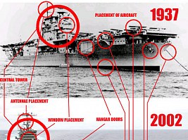
Doug also sent me a couple of images in response to my and other fans' arguments that the NX-01 design looks wrong. I'm including his evidence without further commenting on it. The first image shows a comparison of aircraft carriers, in response to the argument that dated technology should be looking considerably different than what is high tech today. The second image compares the "Flying Wing" experimental aircraft from the 50's with a modern B-2 bomber. The shape of the "Flying Wing" vanished for over 30 years until it was resurrected for the B-2. Could it have been the same with the NX-01 and the Akira? The B-52, finally, is an example for a design with an exceptionally long lifespan. This bomber has survived two or three generations of newer aircraft already now, and maybe it could be the same with starship designs.
See Also
A Close Look at Enterprise NX-01 - with first-hand information by Doug Drexler
Credits
Thanks to Paul Frenczli, Steven Lee, John Payne Niklas and Jim Bray.

Back to Starship Articles index


 Top view